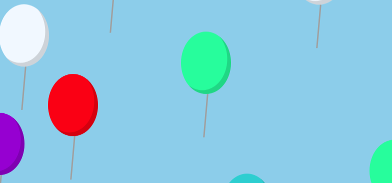
CSSでいくつもの風船をふわふわ・ゆらゆらさながら舞い上がらせるCSSアニメーションサンプルです。
See the Pen CSS | wobbling animation by yochans (@yochans) on CodePen.
HTMLはballoonsの中のdivタグがひとつの風船です。
今回は20個の風船を作成しています。
<div id="container">
	<div class="balloons">
		<div></div><div></div><div></div><div></div><div></div>
		<div></div><div></div><div></div><div></div><div></div>
		<div></div><div></div><div></div><div></div><div></div>
		<div></div><div></div><div></div><div></div><div></div>
		<div></div><div></div><div></div><div></div><div></div>
	</div>
</div>
コンテナ部分、風船を範囲より下に配置して、範囲より上に移動させてますので、「overflow: hidden」で範囲外を非表示にしています。
#container {
	position: relative;
	height: 300px;
	margin: 0;
	padding: 0;
	background: #87ceeb;
	overflow: hidden;
}
風船のデザイン部分です。
「before」は紐の部分で「after」は結んだ部分ですが「after」で個別に色を変更するのが面倒でしたので今回はお蔵入りしています。
.balloons div {
	position: absolute;
	left: 0;
	bottom: -150px;
	width: 80px;
	height: 100px;
	background: #ffa07a;
	border-radius: 50%;
	box-shadow: -6px -6px 0 rgba(0, 0, 0, 0.15) inset;
}

.balloons div:before {
	content: '';
	position: absolute;
	left: 38px;
	bottom: -70px;
	width: 2px;
	height: 70px;
	background: #a0a0a0;
	transform: rotate(5deg);
}

/* .balloons div:after {
	content:"▲";
	position: absolute;
	left: 33px;
	bottom: -13px;
	color: #ffa07a;
} */
風船ひとつひとつのCSSです。
X軸の初期位置をpositionのleftで指定しています。1~10個目、11~20個目で横幅を2周している感じです。
%指定なのはコンテナ部分の可変がありますので、レスポンシブにするため。
横揺れ(wobbling_x)、縦揺れ(wobbling_y)、上へ移動(fly_high)と同時に3つのアニメーション@keyframesを指定しています。
上へ移動(fly_high)のアニメーション指定では、アニメーション時間(1つ目の秒指定)にランダム性を持たせて指定しています。
また、11~20個目ではアニメーション開始時間(2つ目の秒指定)を指定して遅らせて風船が上昇してくるグループとしています。
.balloons div:nth-of-type(1) {
	left: -5%;
	background: #9400d3;
	animation: wobbling_x 0.8s ease-in-out infinite alternate,
		wobbling_y 1.1s ease-in-out infinite alternate,
		fly_high 13s ease-in-out infinite;
}

.balloons div:nth-of-type(2) {
	left: 12%;
	background: #ffc0cb;
	animation: wobbling_x 0.8s ease-in-out infinite alternate,
		wobbling_y 1.1s ease-in-out infinite alternate,
		fly_high 7s ease-in-out infinite;
}

.balloons div:nth-of-type(3) {
	left: 18%;
	background: #ffa07a;
	animation: wobbling_x 0.8s ease-in-out infinite alternate,
		wobbling_y 1.1s ease-in-out infinite alternate,
		fly_high 16s ease-in-out infinite;
}

.balloons div:nth-of-type(4) {
	left: 22%;
	background: #f0f8ff;
	animation: wobbling_x 0.8s ease-in-out infinite alternate,
		wobbling_y 1.1s ease-in-out infinite alternate,
		fly_high 14s ease-in-out infinite;
}

.balloons div:nth-of-type(5) {
	left: 36%;
	background: #ffa07a;
	animation: wobbling_x 0.8s ease-in-out infinite alternate,
		wobbling_y 1.1s ease-in-out infinite alternate,
		fly_high 7s ease-in-out infinite;
}

.balloons div:nth-of-type(6) {
	left: 50%;
	background: #00fa9a;
	animation: wobbling_x 0.9s ease-in-out infinite alternate,
		wobbling_y 1.2s ease-in-out infinite alternate,
		fly_high 12s ease-in-out infinite;
}

.balloons div:nth-of-type(7) {
	left: 62%;
	background: #ffc0cb;
	animation: wobbling_x 0.8s ease-in-out infinite alternate,
		wobbling_y 1.1s ease-in-out infinite alternate,
		fly_high 15s ease-in-out infinite;
}

.balloons div:nth-of-type(8) {
	left: 68%;
	background: #9400d3;
	animation: wobbling_x 0.8s ease-in-out infinite alternate,
		wobbling_y 1.1s ease-in-out infinite alternate,
		fly_high 7s ease-in-out infinite;
}

.balloons div:nth-of-type(9) {
	left: 78%;
	background: #ffa07a;
	animation: wobbling_x 0.9s ease-in-out infinite alternate,
		wobbling_y 1.2s ease-in-out infinite alternate,
		fly_high 9s ease-in-out infinite;
}

.balloons div:nth-of-type(10) {
	left: 90%;
	background: #ff0000;
	animation: wobbling_x 0.8s ease-in-out infinite alternate,
		wobbling_y 1.1s ease-in-out infinite alternate,
		fly_high 11s ease-in-out infinite;
}

.balloons div:nth-of-type(11) {
	left: 0%;
	background: #f0f8ff;
	animation: wobbling_x 0.8s ease-in-out infinite alternate,
		wobbling_y 1.1s ease-in-out infinite alternate,
		fly_high 9s ease-in-out infinite 7s;
}

.balloons div:nth-of-type(12) {
	left: 3%;
	background: #ffa07a;
	animation: wobbling_x 0.8s ease-in-out infinite alternate,
		wobbling_y 1.1s ease-in-out infinite alternate,
		fly_high 7s ease-in-out infinite 2s;
}

.balloons div:nth-of-type(13) {
	left: 10%;
	background: #ff0000;
	animation: wobbling_x 0.8s ease-in-out infinite alternate,
		wobbling_y 1.1s ease-in-out infinite alternate,
		fly_high 8s ease-in-out infinite 5s;
}

.balloons div:nth-of-type(14) {
	left: 25%;
	background: #00ced1;
	animation: wobbling_x 0.8s ease-in-out infinite alternate,
		wobbling_y 1.1s ease-in-out infinite alternate,
		fly_high 12s ease-in-out infinite 6s;
}

.balloons div:nth-of-type(15) {
	left: 37%;
	background: #00fa9a;
	animation: wobbling_x 0.8s ease-in-out infinite alternate,
		wobbling_y 1.1s ease-in-out infinite alternate,
		fly_high 7s ease-in-out infinite 4s;
}

.balloons div:nth-of-type(16) {
	left: 45%;
	background: #00ced1;
	animation: wobbling_x 0.9s ease-in-out infinite alternate,
		wobbling_y 1.2s ease-in-out infinite alternate,
		fly_high 9s ease-in-out infinite;
}

.balloons div:nth-of-type(17) {
	left: 55%;
	background: #ffc0cb;
	animation: wobbling_x 0.8s ease-in-out infinite alternate,
		wobbling_y 1.1s ease-in-out infinite alternate,
		fly_high 13s ease-in-out infinite 8s;
}

.balloons div:nth-of-type(18) {
	left: 60%;
	background: #f0f8ff;
	animation: wobbling_x 0.8s ease-in-out infinite alternate,
		wobbling_y 1.1s ease-in-out infinite alternate,
		fly_high 10s ease-in-out infinite 1s;
}

.balloons div:nth-of-type(19) {
	left: 75%;
	background: #00fa9a;
	animation: wobbling_x 0.9s ease-in-out infinite alternate,
		wobbling_y 1.2s ease-in-out infinite alternate,
		fly_high 15s ease-in-out infinite 7s;
}

.balloons div:nth-of-type(20) {
	left: 95%;
	background: #00ced1;
	animation: wobbling_x 0.8s ease-in-out infinite alternate,
		wobbling_y 1.1s ease-in-out infinite alternate,
		fly_high 11s ease-in-out infinite 6s;
}
アニメーションの各@keyframesです。
ふわふわ揺らぎの部分は以下のページで紹介しています。
ふわふわ・ゆらゆらさせるCSSアニメーションサンプル | ONE NOTES
上への移動(fly_high)は「transform:translateY()」にてコンテナ部分より上の位置を指定しています。
@keyframes wobbling_x {
	0% {
		margin-left: 8px;
	}

	100% {
		margin-left: 0px;
	}
}

@keyframes wobbling_y {
	0% {
		margin-bottom: 0px;
	}

	100% {
		margin-bottom: 8px;
	}
}

@keyframes fly_high {
	100% {
		transform:translateY(-1000px);
	}
}
こんにちは。コード参考にさせていただきます!