色とりどりの円が次々に広がる爆発エフェクトをCSSだけで実装するアニメーションを紹介しています。
CSSだけで実装するにあたり、「円を移動させながら」か「円の色を変えながら」か迷いましたが、今回は後者にしました。
円の位置は固定で、爆発毎に色を変える事でランダムな感じのアニメーションを作成しています。
カラフルな爆発エフェクトのCSSアニメーション
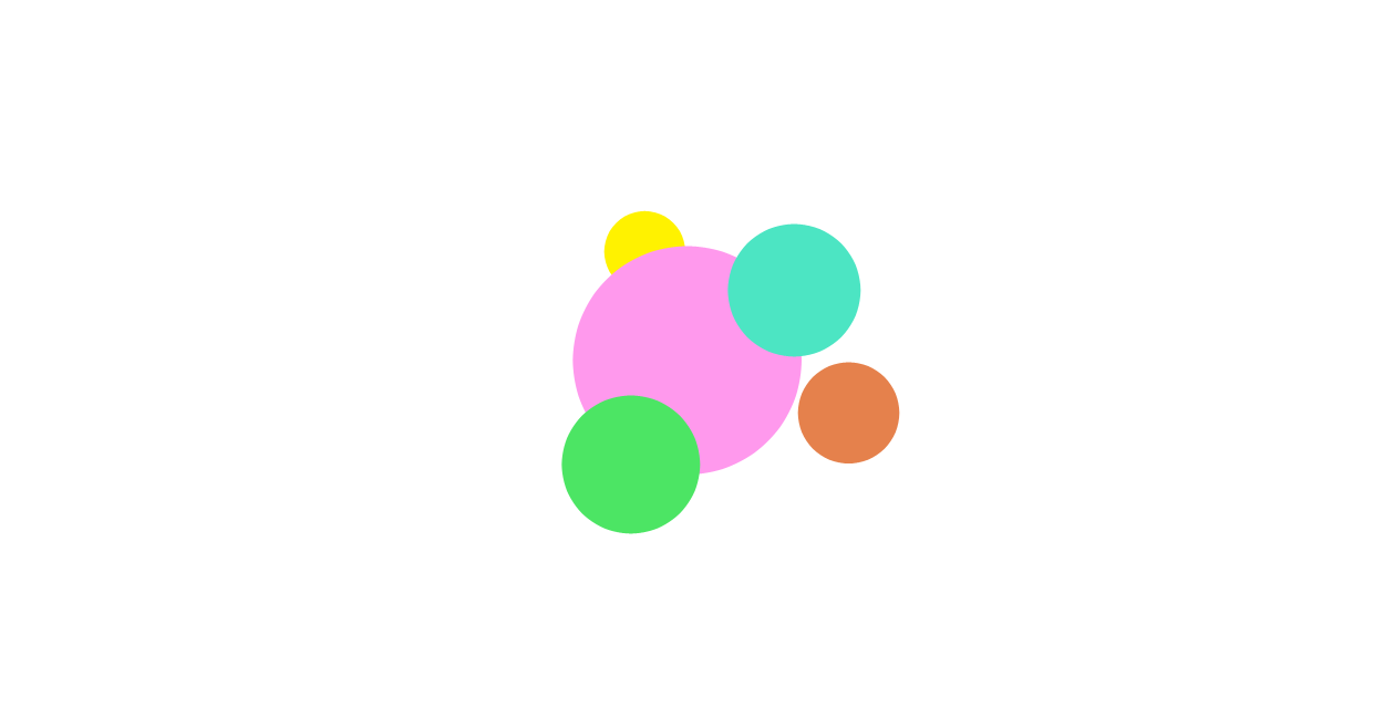
カラフルな円の爆発エフェクトのCSSアニメーションです。
HTML、CSS共に出来るだけシンプルな構造で作成しています。
動作サンプルでは白背景ですが、黒背景の方が映えるかもしれません。
See the Pen CSS | Border expand animation by yochans (@yochans) on CodePen.
HTMLにはコンテナとなる親要素「.container」、爆発の部分を「.explosions」として中に各円のspanタグを5つ設置しています。
<div class="container">
	<div class="explosions">
		<span></span><span></span><span></span><span></span><span></span>
	</div>
</div>コンテナ要素「.container」に position: relative で基準点として爆発部分は絶対値で配置しています。
また、はみ出る事を考慮して overflow: hidden を指定しています。
爆発部分の各要素は「.explosions span」となります。
円のサイズは width と height で基本サイズを指定、アニメーションで最大2倍のサイズになります。
爆発部分には、時間軸が違う「円の拡縮」「色の変更アニメーション」、ふたつのanimation @keyframes を指定しています。
「円の拡縮アニメーション」は transform: scale() で指定していて一秒間に1倍サイズ、2倍サイズの2種類が交互にアニメーションされます。
「色の変更アニメーション」は各要素が2.5秒間の間に5色で切り替わるようにしています。
アニメーションは疑似クラス :nth-child() を使って個別に指定、それぞれ開始時間をずらしています。
2つ目の秒指定値、animation-delay(遅延)で負の値を指定しているのは、同じ色が連続しないように開始位置を調節している為です。
.container {
	position: relative;
	width: 100%;
	height: 250px;
	overflow: hidden;
}

.explosions span {
	position: absolute;
	width: 50px;
	height: 50px;
	border-radius: 50%;
	transform: scale(0);
}

.explosions span:nth-child(1) {
	top: 50px;
	left: 50px;
	animation: explosions-anim 2s 0s linear infinite,
		color-anim 2.5s 0s linear infinite;
}

.explosions span:nth-child(2) {
	top: 50px;
	left: 100px;
	animation: explosions-anim 2s 0.2s linear infinite,
		color-anim 2.5s -1s linear infinite;
}

.explosions span:nth-child(3) {
	top: 75px;
	left: 75px;
	animation: explosions-anim 2s 0.4s linear infinite,
		color-anim 2.5s -2s linear infinite;
}

.explosions span:nth-child(4) {
	top: 100px;
	left: 50px;
	animation: explosions-anim 2s 0.6s linear infinite,
		color-anim 2.5s -3s linear infinite;
}

.explosions span:nth-child(5) {
	top: 100px;
	left: 100px;
	animation: explosions-anim 2s 0.8s linear infinite,
		color-anim 2.5s -4s linear infinite;
}


@keyframes explosions-anim {
	0% {
		transform: scale(0);
	}

	35% {
		transform: scale(0);
	}

	49.9% {
		transform: scale(1);
	}

	50% {
		transform: scale(0);
	}

	80% {
		transform: scale(0);
	}

	99.9% {
		transform: scale(2);
	}

	100% {
		transform: scale(0);
	}
}


@keyframes color-anim {

	0%, 100% {
		background: #84ff84;
	}

	20% {
		background: #84ffff;
	}

	40% {
		background: #ff84ff;
	}

	60% {
		background: #ff8484;
	}

	80% {
		background: #ffff84;
	}
}