ピュアなCSSのみで色とりどりの紙吹雪が舞うアニメーションサンプルです。
別記事で紹介している雨が降る、雪が降るなどのシリーズになります。
CSSのみで雪が降るアニメーションサンプル
CSSのみで雨が降るアニメーションサンプル
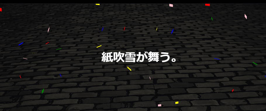
紙吹雪が舞うCSSアニメーションサンプル
CSSのanimationプロパティを使って出来るだけランダムな感じでカラフルな紙吹雪が舞うアニメーションを作成してみました。
以下は動作サンプルとサンプルコードになります。
See the Pen CSS | Snow Animation by yochans (@yochans) on CodePen.
HTMLには紙吹雪の他、必要に応じて背景画像やテキストを入れれるように親要素 .container を配置しています。
画像、テキストともに適当ですがサンプルとして入れてあります、不要なら削除して下さい。
<div class="container">
  <img src="https://1-notes.com/images/ishidatami.jpg" border="0" />
	<div class="confetti"><span></span><span></span><span></span><span></span>
		<span></span><span></span><span></span><span></span><span></span>
		<span></span><span></span><span></span><span></span><span></span>
		<span></span><span></span><span></span><span></span><span></span>
		<span></span><span></span><span></span><span></span><span></span>
		<span></span><span></span><span></span><span></span><span></span>
		<span></span><span></span><span></span><span></span><span></span>
		<span></span><span></span><span></span><span></span><span></span>
		<span></span><span></span><span></span><span></span><span></span>
		<span></span><span></span><span></span><span></span><span></span>
	</div>
	<p>紙吹雪が舞う。</p>
</div>
CSSは少々長めですが、難しい処理はしていません。
今回はanimationキーフレームが右に向かって落ちる用と左に向かって落ちる用の2種類あり、サイズは3種類、色は5色、落ちる速度は4種類ありますが、それぞれ簡単に増減、カスタマイズできると思います。
HTMLやCSSコードの制作過程や詳しい解説は、全コードの下にて個別に紹介しています。
.container {
	position: relative;
	width: 100%;
	background: #06061a;
	overflow: hidden;
	/* for text	 */
	display: flex;
	justify-content: center;
	align-items: center;
}

.container img {
	width: 100%;
	filter: brightness(0.2);
}

.confetti {
	position: absolute;
	width: 100%;
	height: 100%;
}

.confetti span {
	position: absolute;
	top: -10%;
	left: 0;
	width: 1.5vw;
	height: 1vw;
	background: #FFF;
}

/* add animation */
.confetti span:nth-child(2n+1) {
	animation: confetti-anim-1 10s 0s linear infinite;
}

.confetti span:nth-child(2n+2) {
	animation: confetti-anim-2 10s 0s linear infinite;
}

/* side position */
.confetti span:nth-child(1) {
	left: 0%;
}

.confetti span:nth-child(2) {
	left: 2%;
}

.confetti span:nth-child(3) {
	left: 4%;
}

.confetti span:nth-child(4) {
	left: 6%;
}

.confetti span:nth-child(5) {
	left: 8%;
}

.confetti span:nth-child(6) {
	left: 10%;
}

.confetti span:nth-child(7) {
	left: 12%;
}

.confetti span:nth-child(8) {
	left: 14%;
}

.confetti span:nth-child(9) {
	left: 16%;
}

.confetti span:nth-child(10) {
	left: 18%;
}

.confetti span:nth-child(11) {
	left: 20%;
}

.confetti span:nth-child(12) {
	left: 22%;
}

.confetti span:nth-child(13) {
	left: 24%;
}

.confetti span:nth-child(14) {
	left: 26%;
}

.confetti span:nth-child(15) {
	left: 28%;
}

.confetti span:nth-child(16) {
	left: 30%;
}

.confetti span:nth-child(17) {
	left: 32%;
}

.confetti span:nth-child(18) {
	left: 34%;
}

.confetti span:nth-child(19) {
	left: 36%;
}

.confetti span:nth-child(20) {
	left: 38%;
}

.confetti span:nth-child(21) {
	left: 40%;
}

.confetti span:nth-child(22) {
	left: 42%;
}

.confetti span:nth-child(23) {
	left: 44%;
}

.confetti span:nth-child(24) {
	left: 46%;
}

.confetti span:nth-child(25) {
	left: 48%;
}

.confetti span:nth-child(26) {
	left: 50%;
}

.confetti span:nth-child(27) {
	left: 52%;
}

.confetti span:nth-child(28) {
	left: 54%;
}

.confetti span:nth-child(29) {
	left: 56%;
}

.confetti span:nth-child(30) {
	left: 58%;
}

.confetti span:nth-child(31) {
	left: 60%;
}

.confetti span:nth-child(32) {
	left: 62%;
}

.confetti span:nth-child(33) {
	left: 64%;
}

.confetti span:nth-child(34) {
	left: 66%;
}

.confetti span:nth-child(35) {
	left: 68%;
}

.confetti span:nth-child(36) {
	left: 70%;
}

.confetti span:nth-child(37) {
	left: 72%;
}

.confetti span:nth-child(38) {
	left: 74%;
}

.confetti span:nth-child(39) {
	left: 76%;
}

.confetti span:nth-child(40) {
	left: 78%;
}

.confetti span:nth-child(41) {
	left: 80%;
}

.confetti span:nth-child(42) {
	left: 82%;
}

.confetti span:nth-child(43) {
	left: 84%;
}

.confetti span:nth-child(44) {
	left: 86%;
}

.confetti span:nth-child(45) {
	left: 88%;
}

.confetti span:nth-child(46) {
	left: 90%;
}

.confetti span:nth-child(47) {
	left: 92%;
}

.confetti span:nth-child(48) {
	left: 94%;
}

.confetti span:nth-child(49) {
	left: 96%;
}

.confetti span:nth-child(50) {
	left: 98%;
}

/* colors */
.confetti span:nth-child(5n+1) {
	background: red;
}

.confetti span:nth-child(5n+2) {
	background: blue;
}

.confetti span:nth-child(5n+3) {
	background: green;
}

.confetti span:nth-child(5n+4) {
	background: pink;
}

.confetti span:nth-child(5n+5) {
	background: yellow;
}


/* animation-duration */
.confetti span:nth-child(4n+1) {
	animation-duration: 5s;
}

.confetti span:nth-child(4n+2) {
	animation-duration: 12s;
}

.confetti span:nth-child(4n+3) {
	animation-duration: 8s;
}

.confetti span:nth-child(4n+4) {
	animation-duration: 6s;
}


/* animation-delay */
.confetti span:nth-child(11n+1) {
	animation-delay: 0s;
}

.confetti span:nth-child(11n+2) {
	animation-delay: 9s;
}

.confetti span:nth-child(11n+3) {
	animation-delay: 2s;
}

.confetti span:nth-child(11n+4) {
	animation-delay: 5s;
}

.confetti span:nth-child(11n+5) {
	animation-delay: 6s;
}

.confetti span:nth-child(11n+6) {
	animation-delay: 7s;
}

.confetti span:nth-child(11n+7) {
	animation-delay: 3s;
}

.confetti span:nth-child(11n+8) {
	animation-delay: 1s;
}

.confetti span:nth-child(11n+9) {
	animation-delay: 2s;
}

.confetti span:nth-child(11n+10) {
	animation-delay: 11s;
}

.confetti span:nth-child(11n+11) {
	animation-delay: 10s;
}

/* animation */

@keyframes confetti-anim-1 {
	0% {
		top: -10%;
		transform: translateX(0) rotateX(0) rotateY(0);
	}

	100% {
		top: 100%;
		transform: translateX(20vw) rotateX(180deg) rotateY(360deg);
	}
}

@keyframes confetti-anim-2 {
	0% {
		top: -10%;
		transform: translateX(0) rotateX(0) rotateY(0);
	}

	100% {
		top: 100%;
		transform: translateX(-20vw) rotateX(180deg) rotateY(360deg);
	}
}

/* text */
.container p {
	position: absolute;
	font-size: 36px;
	font-weight: bold;
	color: #FFF;
}
サンプルコードの作成工程
コンテナ
紙吹雪や背景、テキストを入れておくためのコンテナ部分です。
position: relative でコンテナを中に置く要素の position の基準点にします。
また、overflow: hidden でコンテナ要素の外側にある紙吹雪を非表示にする必要があります。
display: flex 以下は、動作サンプルにてテキストを縦横中央配置する為のものですので不要な場合は削除して下さい。
.container {
	position: relative;
	width: 100%;
	overflow: hidden;
	/* for text	 */
	display: flex;
	justify-content: center;
	align-items: center;
}
紙吹雪をひとつ作成する
基本となる紙吹雪をひとつ適当な場所に作成します。
HTMLで必要分のspanタグを先に並べてしまうと、重なり合って調節が困難になってしまうので最初から作る場合はspanタグをひとつにしておきます。
<div class="container">
	<div class="confetti">
		<span></span>
	</div>
</div>
サンプルでは紙吹雪の幅と高さをpxではなくvwで指定しています。
vwは画面の幅あるいはブラウザの表示領域幅に合わせた可変サイズです。表示可能な領域幅に応じて拡縮します。
サイズや色については別途、nth-child(n) にて設定しています。
.confetti {
	position: absolute;
	width: 100%;
	height: 100%;
}

.confetti span {
	position: absolute;
	top: 50%; /* テスト用の配置 */
	left: 50%; /* テスト用の配置 */
	width: 1.5vw;
	height: 1vw;
	background: #FFF;
}
紙吹雪の初期配置
作成した紙吹雪を必要な数だけspanタグを複製し、ポジションの left を調整して横一列に並べます。
サンプルでは50個のサンプルではを作成、2%置きに配置されるようにしています。
top は要素の表示領域の上にくるよう -10pxを指定しています。
.confetti span {
	position: absolute;
	top: -10%; /* コンテナの上に配置 */
	left: 0;
	width: 1.5vw;
	height: 1vw;
	background: #FFF;
}

/* Side position */
.snows span:nth-child(1) {
	left: 0%;
}
.snows span:nth-child(2) {
	left: 2%;
}

/* ・・省略・・ */

.snows span:nth-child(49) {
	left: 96%;
}
.snows span:nth-child(50) {
	left: 98%;
}
CSSアニメーションにて、左右に揺らしながら下に落としていくことで、順に落ちてくる感じにします。
紙吹雪の大きさ
紙吹雪の大きさを3種類にわけています。
サンプルでは nth-child() にて3種類のサイズの紙吹雪を作成しています。
3種類ですので3n+1として3個置きに指定されるようにします。
/* size */
.confetti span:nth-child(3n+1) {
	width: 1vw;
	height: 0.6vw;
}

.confetti span:nth-child(3n+2) {
	width: 1.25vw;
	height: 0.8vw;
}

.confetti span:nth-child(3n+3) {
	width: 1.5vw;
	height: 1vw;
}
紙吹雪の色
紙吹雪の色をサイズと同じ方法で5種類にわけまています。
サイズと違う種類にする事で、同じ色でも様々なサイズが表示されるようにします。
サンプルでは nth-child() にて5種類の色の紙吹雪を作成しています。
5種類ですので5n+1として5個置きに指定されるようにします。
/* colors */
.confetti span:nth-child(5n+1) {
	background: red;
}

.confetti span:nth-child(5n+2) {
	background: blue;
}

.confetti span:nth-child(5n+3) {
	background: green;
}

.confetti span:nth-child(5n+4) {
	background: pink;
}

.confetti span:nth-child(5n+5) {
	background: yellow;
}
紙吹雪が降るアニメーション
紙吹雪、 .confetti span にanimationプロパティを使ってアニメーションキーフレームを指定しています。
今回は2種類のアニメーションを設定していますが、違いは右に向かって落ちていくのか、左に向かって落ちていくのかの違いです。
/* add animation */
.confetti span:nth-child(2n+1) {
	animation: confetti-anim-1 10s 0s linear infinite;
}

.confetti span:nth-child(2n+2) {
	animation: confetti-anim-2 10s 0s linear infinite;
}

/* animation */
@keyframes confetti-anim-1 {
	0% {
		top: -10%;
		transform: translateX(0) rotateX(0) rotateY(0);
	}

	100% {
		top: 100%;
		transform: translateX(20vw) rotateX(180deg) rotateY(360deg);
	}
}

@keyframes confetti-anim-2 {
	0% {
		top: -10%;
		transform: translateX(0) rotateX(0) rotateY(0);
	}

	100% {
		top: 100%;
		transform: translateX(-20vw) rotateX(180deg) rotateY(360deg);
	}
}
アニメーション時間の 10s とアニメーション開始までの遅延となる 0s は別途上書きしています。
linear でアニメーションの動きを一定挙動にして、 infinite で無限ループを指定しています。
アニメーション時間と遅延をずらす
ここまでのままでは、紙吹雪が同じタイミング、同じスピードで横一線に落ちてしまうのでアニメーション時間と開始時間をずらしてランダムチックにします。
アニメーションの開始時間をずらします。
アニメーション開始時間は4種類、アニメーションの遅延は6種類作成しています。
これらは、animationプロパティより後に記述して上書きするようにします。
/* animation-duration */
.confetti span:nth-child(4n+1) {
	animation-duration: 5s;
}

.confetti span:nth-child(4n+2) {
	animation-duration: 12s;
}

.confetti span:nth-child(4n+3) {
	animation-duration: 8s;
}

.confetti span:nth-child(4n+4) {
	animation-duration: 6s;
}
/* animation-delay */
.confetti span:nth-child(11n+1) {
animation-delay: 0s;
}
.confetti span:nth-child(11n+2) {
animation-delay: 9s;
}
.confetti span:nth-child(11n+3) {
animation-delay: 2s;
}
.confetti span:nth-child(11n+4) {
animation-delay: 5s;
}
.confetti span:nth-child(11n+5) {
animation-delay: 6s;
}
.confetti span:nth-child(11n+6) {
animation-delay: 7s;
}
.confetti span:nth-child(11n+7) {
animation-delay: 3s;
}
.confetti span:nth-child(11n+8) {
animation-delay: 1s;
}
.confetti span:nth-child(11n+9) {
animation-delay: 2s;
}
.confetti span:nth-child(11n+10) {
animation-delay: 11s;
}
.confetti span:nth-child(11n+11) {
animation-delay: 10s;
}