文字列や画像などのHTML要素が円枠、円縁に沿って移動するCSSアニメーションを紹介しています。
円に沿って移動するCSSアニメーション
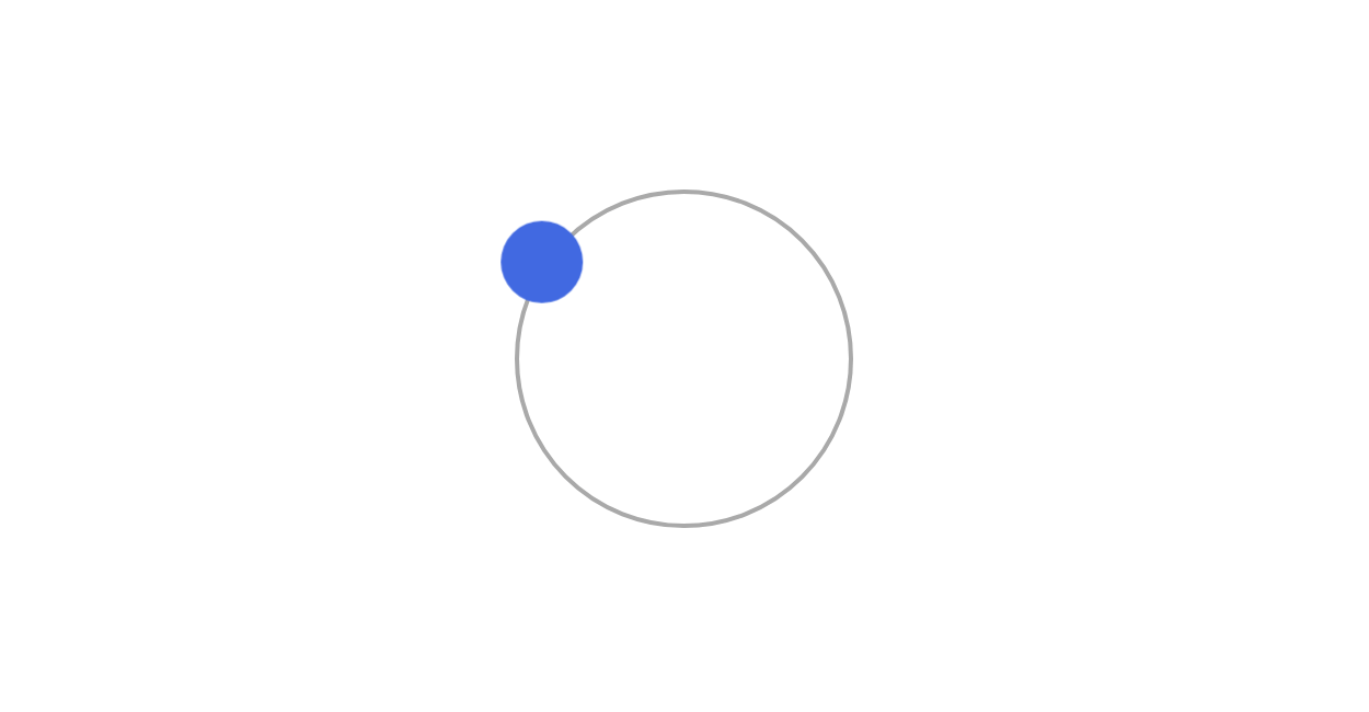
円の縁に沿って周りながら移動するCSSアニメーションサンプルになります。
円も描画していますが、要素の移動に必要なものではありませんので、無くても大丈夫です。
See the Pen CSS | Arc move animation by yochans (@yochans) on CodePen.
HTML
HTMLにはコンテナとして親要素class名「.container」を作成、その中に円の枠になる「.circle」と回転する要素「.item」を設置しています。
<div class="container">
	<div class="circle"></div>
	<div class="item"></div>
</div>
円、要素ともにpositionプロパティを使って絶対値で配置しています。
また、ともに起点は円の中心点になっています。
円の半径(CSSでの指定は直径)と、回転する要素のtranslate()に指定する値は同じ値になります。
円の位置は、回転する要素の位置の4分の1としておけば多分合うと思います。
アニメーションキーフレームの内容は最初のrotate()とtranslate()で回転、2つ目のrotate()で要素の角度といった感じです。
回転させている要素も丸くしてしまったのでわかりませんが、回転している要素の角度は固定されています。
回転に合わせて角度も変更したい場合はrotate()を触れば可能です。
.container {
	position: relative;
	width: 100%;
	height: 250px;
}

.circle {
	position: absolute;
	top: 25px;
	left: 25px;
	width: 200px;
	height: 200px;
	border-radius: 50%;
	border: solid 1px #808080;
}

.item {
	position: absolute;
	top: 100px;
	left: 100px;
	width: 50px;
	height: 50px;
	border-radius: 50%;
	background: #4169e1;
	transform: translateX(-100px);
	animation: circle-move-anim 4s linear infinite;
	/* for text */
	display: flex;
	justify-content: center;
	align-items: center;
	font-size: 30px;
	color: #FFF;
}

@keyframes circle-move-anim {
	0% {
		transform: rotate(0deg) translateX(-100px) rotate(0deg);
	}

	100% {
		transform: rotate(360deg) translateX(-100px) rotate(-360deg);
	}
}