CSSだけで作る波紋が広がる演出のアニメーションサンプルです。
複数の波紋アニメーションを同時に出現させるサンプルなども紹介しています。
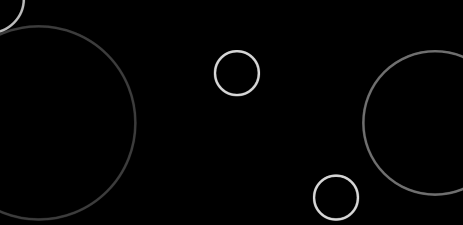
波紋アニメーション
See the Pen CSS | balloons animation by yochans (@yochans) on CodePen.
HTMLはripplesの中のdivタグが波紋となります。
入れ子にしているのは、複数の波紋を追加する予定のためですのでひとつで良い場合は入れ子にする必要はありません。
<div id="container">
	<div class="ripples">
		<div></div>
	</div>
</div>
コンテナ部分、風船を範囲より下に配置して、範囲より上に移動させてますので、「overflow: hidden」で範囲外を非表示にしています。
#container {
	position: relative;
	height: 200px;
	margin: 0;
	padding: 0;
	background: #000;
	overflow: hidden;
}
波紋のデザイン部分とアニメーション@keyframesの指定です。
波紋部分はborderで作成、要素の初期サイズを0, 0にしておきてアニメーションで広げる予定。
.ripples div {
	position: absolute;
	left: 50%;
	top: 50%;
	width: 0;
	height: 0;
	border: solid 2px #FFF;
	border-radius: 50%;
	opacity: 0;
	animation: ripples_anim 1.2s linear infinite;
}
アニメーションの@keyframesです。
波紋の広がりはwidthとheightで調節しています。(scaleだとborderが太くなってしまいます)
中央寄せなど別の方法で起点が中央になっている場合は必要ありませんが、positionで指定しているため広がる際に起点が左上になっていますのでtranslateで位置を調節しています。
波紋を斜めに見た感じにしたい場合はheightの最大値を小さくして、translateを調節するだけです。
50%でアニメーションが完結しているのは、残りの50%を次のアニメーションまでの待機時間にしているだけです。
@keyframes ripples_anim {
	0% {
		opacity: 1;
	}

	50% {
		transform: translate(-200px,-200px);
		width: 400px;
		height: 400px;
		opacity: 0;
	}
}
3重の波紋アニメーション
疑似要素「before」「after」を使って3重の波紋にしたパターン。
ちょっとイマイチな出来、CSSコードはCodePenページから確認して下さい。
See the Pen CSS | ripples animation 2 by yochans (@yochans) on CodePen.
複数の波紋アニメーション
複数の波紋を連続してアニメーションさせてみました。
See the Pen CSS | ripples animation 3 by yochans (@yochans) on CodePen.
サンプル、サンプルコードは波紋の数を10個に増やしたバージョンです。
HTMLにて<div>タグを波紋の数だけ増やします。
<div id="container">
	<div class="ripples">

		<div></div>
		<div></div>
		<div></div>
		<div></div>
		<div></div>

		<div></div>
		<div></div>
		<div></div>
		<div></div>
		<div></div>

	</div>
</div>
複数個ということでひとつひとつの波紋の大きさを小さくしていますが、他は同じです。
10個の波紋の位置とアニメーション開始時間をランダム的に適当に変更しています。
.ripples div:nth-of-type(1) {
	left: 0;
	top: 0;
	animation-delay: 0s;
}

.ripples div:nth-of-type(2) {
	left: 10%;
	top: 50%;
	animation-delay: 3.5s;
}

.ripples div:nth-of-type(3) {
	left: 30%;
	top: 10%;
	animation-delay: 2.5s;
}

.ripples div:nth-of-type(4) {
	left: 40%;
	top: 20%;
	animation-delay: 0.5s;
}

.ripples div:nth-of-type(5) {
	left: 50%;
	top: 30%;
	animation-delay: 2.1s;
}

.ripples div:nth-of-type(6) {
	left: 60%;
	top: 40%;
	animation-delay: 3.2s;
}

.ripples div:nth-of-type(7) {
	left: 70%;
	top: 80%;
	animation-delay: 4.1s;
}

.ripples div:nth-of-type(8) {
	left: 80%;
	top: 70%;
	animation-delay: 1.2s;
}

.ripples div:nth-of-type(9) {
	left: 90%;
	top: 50%;
	animation-delay: 1.7s;
}

.ripples div:nth-of-type(10) {
	left: 100%;
	top: 20%;
	animation-delay: 4.5s;
}