CSSで扇形、クォーターサークルを作成する方法を紹介しています。
目次
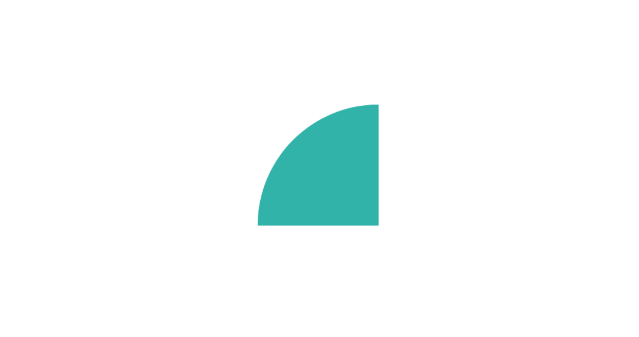
扇形の作り方
CSSのborderプロパティを使った扇形の作成方法です。
扇形と紹介していますが、このサンプルコードの場合、作成可能なのは円の4分の1(クォーターサークル)になります。
See the Pen CSS Cquarter circle by yochans (@yochans) on CodePen.
HTMLにはそれぞれ向きの違う扇形を作成するためのdivタグを追加します。
<div class="cquarter-circle-1"></div>
<div class="cquarter-circle-2"></div>
<div class="cquarter-circle-3"></div>
<div class="cquarter-circle-4"></div>
.cquarter-circle-1 {
position: relative;
width: 100px;
height: 100px;
}
.cquarter-circle-1::after {
content: "";
position: absolute;
border: solid #20b2aa;
border-width: 100px 100px 0 0;
border-top-left-radius: 100px;
}
.cquarter-circle-2 {
position: relative;
width: 100px;
height: 100px;
}
.cquarter-circle-2::after {
content: "";
position: absolute;
border: solid #20b2aa;
border-width: 100px 100px 0 0;
border-top-right-radius: 100px;
}
.cquarter-circle-3 {
position: relative;
width: 100px;
height: 100px;
}
.cquarter-circle-3::after {
content: "";
position: absolute;
border: solid #20b2aa;
border-width: 100px 100px 0 0;
border-bottom-left-radius: 100px;
}
.cquarter-circle-4 {
position: relative;
width: 100px;
height: 100px;
}
.cquarter-circle-4::after {
content: "";
position: absolute;
border: solid #20b2aa;
border-width: 100px 100px 0 0;
border-bottom-right-radius: 100px;
}扇の向きは「border-radius」の方向で調節しています。
| cquarter-circle-1 | border-top-left-radius |
| cquarter-circle-2 | border-top-right-radius |
| cquarter-circle-3 | border-bottom-left-radius |
| cquarter-circle-4 | border-bottom-right-radius |
自由度の高い向きを指定したい場合、transformプロパティのrotate()を親要素に指定します。
下記の場合、45度左回りに回転します。
transform: rotate(-45deg);新しいサイト「Material Box」にて更に多くの図形・マーク・アイコンデザインを紹介しています。
CSS – 扇形 | Material Box