CSSで円柱を作成する方法を紹介しています。
以下の記事にてCSSのpreserve-3dで作る円柱の3D版も紹介していますので、宜しければ是非。
CSS | 3Dな円柱の作り方
目次
円柱の作り方
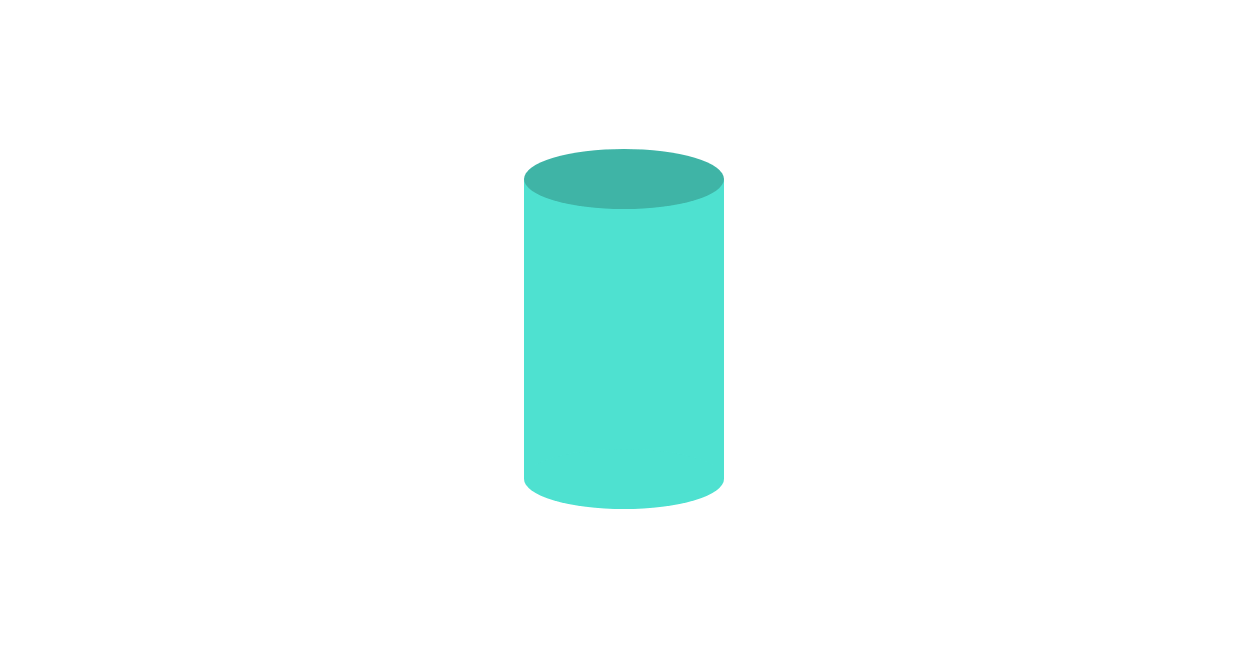
CSSの疑似要素を使ってひとつの要素で円柱を作成する方法です。
See the Pen CSS | Cylinder by yochans (@yochans) on CodePen.
(擬似的に)角度の違う見え方をする3タイプの円柱となるdivタグを追加しています。
<div class="cylinder-1"></div>
<div class="cylinder-2"></div>
<div class="cylinder-3"></div>
CSSの構成は、本体が長方形、biforeが上部分の円、afterが下部分の円(本体と同色)となっています。
円の縦幅と位置を調節する事で、角度の違った見え方の円柱にする事ができます。
円柱 タイプ1
.cylinder-1 {
	width: 100px;
	height: 150px;
	position: relative;
	background: #40e0d0;
}

.cylinder-1::before {
	content: "";
	width: 100px;
	height: 30px;
	position: absolute;
	top: -15px; /* heightの半分 */
	border-radius: 50%;
	background: #34b3a6;
}

.cylinder-1::after {
	content: "";
	width: 100px;
	height: 30px;
	position: absolute;
	top: 135px; /* 本体のheight - heightの半分 */
	border-radius: 50%;
	background: #40e0d0;
}
円柱 タイプ2
.cylinder-2{
	width: 100px;
	height: 150px;
	position: relative;
	background: #4da6ff;
}

.cylinder-2::before {
	content: "";
	width: 100px;
	height: 20px;
	position: absolute;
	top: -10px;
	border-radius: 50%;
	background: #1e90ff;
}

.cylinder-2::after {
	content: "";
	width: 100px;
	height: 20px;
	position: absolute;
	top: 140px;
	border-radius: 50%;
	background: #4da6ff;
}
円柱 タイプ3
.cylinder-3 {
	width: 100px;
	height: 150px;
	position: relative;
	background: #ffa07a;
}

.cylinder-3::before {
	content: "";
	width: 100px;
	height: 10px;
	position: absolute;
	top: -5px;
	border-radius: 50%;
	background: #ff4500;
}

.cylinder-3::after {
	content: "";
	width: 100px;
	height: 10px;
	position: absolute;
	top: 145px;
	border-radius: 50%;
	background: #ffa07a;
}