CSSで疑似要素を使って無限マーク(Infinity)を作成する方法を紹介しています。
無限マーク(Infinity)の作り方
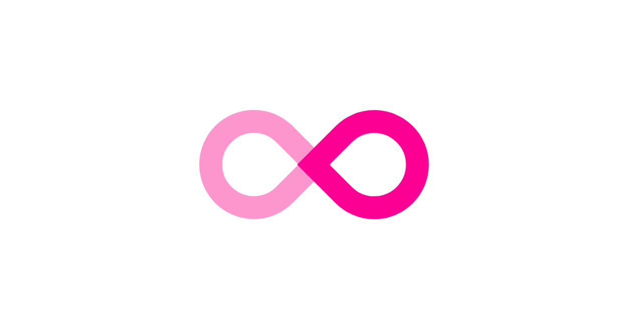
See the Pen CSS Infinity by yochans (@yochans) on CodePen.
左右の2つの疑似要素で表示している色が同色のものと、作業用に左右で色を変更したものを用意しています。
<div class="infinity-1"></div>
<div class="infinity-2"></div>
左部分と右部分、それぞれの幅は重なり合う部分を考慮します。
無限マークの場合は角度を変更した際に横幅が増えるも計算にいれて、要素全体の横幅の半分のサイズを0.275倍した数値になります。
左部分と右部分はborderで表現しています。
「border-radius: 50px 50px 50px 0;」と指定して以下の形状を作成、transformのrotate()角度を変更しています。

角度を右向き、左向きに変更して重なる部分を確認します。
.infinity-1 {
	position: relative;
	width: 200px;
	height: 100px;
}

.infinity-1::before {
	content: "";
	width: 55px;
	height: 55px;
	position: absolute;
	top: 0;
	left: 0;
	border: 20px solid #00bfff;
	border-radius: 50px 50px 0 50px;
	transform: rotate(-45deg);
}

.infinity-1::after {
	content: "";
	width: 55px;
	height: 55px;
	position: absolute;
	top: 0;
	right: 0;
	border: 20px solid #00bfff;
	border-radius: 50px 50px 50px 0;
	transform:rotate(45deg);
}新しいサイト「Material Box」にて更に多くの図形・マーク・アイコンデザインを紹介しています。
CSS – 無限マーク | Material Box