CSSで三角形と台形をあわせた五角形を使って作成する方法と、clip-pathのpolygonを使って作成する方法の2通りを紹介しています。
正五角形の計算式メモ
正五角形に近くなるように、ザックリな数値を出している計算式表です。
| 辺の長さから高さを求める | (x/2)√(5+2√5) |
| 横幅と高さのおおよその比率 | 約1.05、辺の長さが伸びるほど大きくなる |
| おおよその左右にくるY座標 ※CSSで要素を2つにわけた際の高さ | 高さ×0.38 |
| おおよその底辺のX座標(2点) | 横幅×0.19と0.81 |
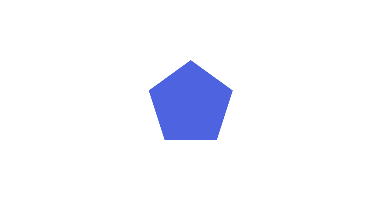
五角形の作り方
疑似要素を使って三角形と台形をあわせて五角形を作成する方法を紹介しています。
See the Pen CSS Pentagon by yochans (@yochans) on CodePen.
五角形の表示サンプルと、作業用に上部分(before)と下部分(after)で色を変えているパターンの2種類を作成しています。
<div class="container">
	<div class="pentagon-1"></div>
	<div class="pentagon-2"></div>
</div>
正五角形に近い五角形を表示したい場合は、CSS側で要素の幅を高さに対しておおよその1.05倍にしておく必要があります。(またはその逆)
高さ、横幅に合わせて各ポジションやサイズを変更する必要があります。
もっとも単純に拡大・縮小するにはscale()を使った方が早いかもしれません。
先の項目にて、変数とcalc()を使って各数値を算出するバージョンのCSSコードも紹介しています。
.pentagon-1 {
	position: relative;
	width: 157.5px;
	height: 150px;
}

.pentagon-1::before {
	content: "";
	width: 157.5px;
	height: 57px;
	position: absolute;
	border-bottom: 57px solid #00ced1;
	border-left: 78.75px solid transparent;
	border-right: 78.75px solid transparent;
	box-sizing: border-box;
}

.pentagon-1::after {
	content: "";
	width: 157.5px;
	height: 124px;
	position: absolute;
	top: 57px;
	border-top: 93px solid #00ced1;
	border-left: 29.9px solid transparent;
	border-right: 29.9px solid transparent;
	box-sizing: border-box;
}
.pentagon-2 {
position: relative;
width: 157.5px;
height: 150px;
}
.pentagon-2::before {
content: "";
width: 157.5px;
height: 57px;
position: absolute;
border-bottom: 57px solid #696969;
border-left: 78.75px solid transparent;
border-right: 78.75px solid transparent;
box-sizing: border-box;
}
.pentagon-2::after {
content: "";
width: 157.5px;
height: 124px;
position: absolute;
top: 57px;
border-top: 93px solid #000;
border-left: 29.9px solid transparent;
border-right: 29.9px solid transparent;
box-sizing: border-box;
}新しいサイト「Material Box」にて更に多くの図形・マーク・アイコンデザインを紹介しています。
CSS – 五角形 | Material Box
正五角形を変数とcalc()で計算して作成
正五角形に近い形状を毎回すべて計算するのが億劫でしたので、変数とcalc()で計算して作成するCSSコードを作成してみました。
See the Pen CSS Pentagon (variable and calc) by yochans (@yochans) on CodePen.
<div class="container">
	<div class="pentagon-1"></div>
	<div class="pentagon-2"></div>
	<div class="pentagon-3"></div>
</div>
※近い数値になるように作成してみましたが、完全な正五角形とはなりませんので、正確な数値は必要な方は避けて下さい。
「高さから計算」「(要素の)横幅から計算」「辺の長さから計算」と3タイプ用意しました。
公式が見つかりやすい「辺の長さから計算」が一番マシかもしれません。
とはいえ、私にはcalcでルート式とか無理ゲーですので、最初に横幅を求めている時点でおおよその数値になってしまいます。
何度か正確な正五角形と比較しましたが、CSSで描画して表示するだけの分には普通に正五角形に見えると思います。
高さから求める
高さからおおよその割合で逆算しています。
.pentagon-1 {
	position: relative;
	--h: 150px;
	--w: calc(var(--h)*1.05);
	width: var(--w);
	height: var(--h);
	box-sizing: border-box;
}

.pentagon-1::before {
	content: "";
	width: var(--w);
	height: calc(var(--h)*0.38);
	position: absolute;
	top: 0;
	left: 0;
	border-left: calc(var(--w)*0.5) solid transparent;
	border-right: calc(var(--w)*0.5) solid transparent;
	border-bottom: calc(var(--h)*0.38) solid #0091EA;
	box-sizing: border-box;
}

.pentagon-1::after {
	content: "";
	width: var(--w);
	height: calc(var(--h)*0.62);
	position: absolute;
	top: calc(var(--h)*0.38);
	left: 0;
	border-top: calc(var(--h)*0.62) solid #0091EA;
	border-left: calc(var(--w)*0.19) solid transparent;
	border-right:  calc(var(--w)*0.19) solid transparent;
	box-sizing: border-box;
}
横幅から求める
.pentagon-2 {
	position: relative;
	--w: 157.5px;
	--h: calc(var(--w)*0.952);
	width: var(--w);
	height: var(--h);
	box-sizing: border-box;
}

.pentagon-2::before {
	content: "";
	width: var(--w);
	height: calc(var(--h)*0.38);
	position: absolute;
	top: 0;
	left: 0;
	border-left: calc(var(--w)*0.5) solid transparent;
	border-right: calc(var(--w)*0.5) solid transparent;
	border-bottom: calc(var(--h)*0.38) solid #0091EA;
	box-sizing: border-box;
}

.pentagon-2::after {
	content: "";
	width: var(--w);
	height: calc(var(--h)*0.62);
	position: absolute;
	top: calc(var(--h)*0.38);
	left: 0;
	border-top: calc(var(--h)*0.62) solid #0091EA;
	border-left: calc(var(--w)*0.19) solid transparent;
	border-right:  calc(var(--w)*0.19) solid transparent;
	box-sizing: border-box;
}
辺の長さから求める
.pentagon-3 {
	position: relative;
	--hen: 97.5px;
	--h: calc(var(--hen)*1.535);
	--w: calc(var(--h)*1.05);
	width: var(--w);
	height: var(--h);
	box-sizing: border-box;
}

.pentagon-3::before {
	content: "";
	width: var(--w);
	height: calc(var(--h)*0.38);
	position: absolute;
	top: 0;
	left: 0;
	border-left: calc(var(--w)*0.5) solid transparent;
	border-right: calc(var(--w)*0.5) solid transparent;
	border-bottom: calc(var(--h)*0.38) solid #0091EA;
	box-sizing: border-box;
}

.pentagon-3::after {
	content: "";
	width: var(--w);
	height: calc(var(--h)*0.62);
	position: absolute;
	top: calc(var(--h)*0.38);
	left: 0;
	border-top: calc(var(--h)*0.62) solid #0091EA;
	border-left: calc(var(--w)*0.19) solid transparent;
	border-right:  calc(var(--w)*0.19) solid transparent;
	box-sizing: border-box;
}
五角形の作り方(枠線、ラインのみバージョン)
単色ではなく、枠線・ラインで表現する五角形をCSSで作成する方法です。
See the Pen CSS | Pentagon(line only) by yochans (@yochans) on CodePen.
HTMLでは本体の子要素に五角形の5本のライン分に必要なdivタグを追加しています。
<div class="pentagon-1">
	<div></div>
	<div></div>
	<div></div>
	<div></div>
	<div></div>
</div>

<!--辺ごとに色が違うバージョン-->
<div class="pentagon-2">
	<div></div>
	<div></div>
	<div></div>
	<div></div>
	<div></div>
</div>
ラインとなるdivタグはborderの線をborder-top1本線になるようにします。
5つの要素(線)をそれぞれ72度刻みで回転させると五角形になります。
一本目を上の頂点として、順番に右回転させています、0degから始めた場合はサンプルのものから上下反転した五角形になります。
この方法では、background-colorで背景色も付けることも可能です。
線になる子要素のwidthとheightは、それぞれ線の長さと間隔を調節できますが、サンプルの値は丁度枠内に入る数値にしてあるだけです。
.pentagon-1 {
	width: 157.5px;
	height: 150px;
	position: relative;
}

.pentagon-1 div {
	width: 94px; /* サイズ調整 */
	height: 130px; /* サイズ調整 */
	position: absolute;
	top: 18px; /* 位置調整 */
	left: 33px; /* 位置調整 */
	border-top: 2px solid #000;
	transform-origin: center; /* 必要になった時用 */
	box-sizing: border-box; /* 調整しやすくする */
}

.pentagon-1 div:nth-of-type(1) {
	transform: rotate(36deg);
}

.pentagon-1 div:nth-of-type(2) {
	transform: rotate(108deg);
}

.pentagon-1 div:nth-of-type(3) {
	transform: rotate(180deg);
}

.pentagon-1 div:nth-of-type(4) {
	transform: rotate(252deg);
}

.pentagon-1 div:nth-of-type(5) {
	transform: rotate(324deg);
}
辺ごとに線の色が違うバージョン
.pentagon-2 {
	width: 157.5px;
	height: 150px;
	position: relative;
}

.pentagon-2 div {
	width: 94px;
	height: 130px;
	position: absolute;
	top: 18px;
	left: 33px;
	border-top: 2px solid #000;
	transform-origin: center;
	box-sizing: border-box;
}

.pentagon-2 div:nth-of-type(1) {
	transform: rotate(36deg);
	border-color: blue;
}

.pentagon-2 div:nth-of-type(2) {
	transform: rotate(108deg);
	border-color: red;
}

.pentagon-2 div:nth-of-type(3) {
	transform: rotate(180deg);
	border-color: green;
}

.pentagon-2 div:nth-of-type(4) {
	transform: rotate(252deg);
	border-color: purple;
}

.pentagon-2 div:nth-of-type(5) {
	transform: rotate(324deg);
	border-color: black;
}
polygonを使った五角形の作り方
clip-pathプロパティのpolygonを使った五角形の作り方です。
See the Pen CSS Pentagon (polygon) by yochans (@yochans) on CodePen.
<div class="container">
	<div class="pentagon-1"></div>
	<div class="pentagon-2"></div>
</div>
polygonの高さの指定は100%に設定してありますので、正五角形近くで表現したい場合は、CSS側で要素の幅を高さに対して約1.05倍にしておく必要があります。(同じサイズにすると縦長になります。)
polygon()の指定順は上の頂点から右回りに指定しています。
.pentagon-1 {
	position: relative;
	width: 157.5px;
	height: 150px;
	background: #000;
	clip-path: polygon( 50% 0, 100% 38%, 81% 100%, 19% 100%, 0 38%);
}