CSSで五芒星・ペンタグラム(Pentagram)を作成する方法を、枠線・ラインのみを表示可能なバージョンとclip-pathのpolygonを使った方法(単色のみ)にて紹介しています。
五芒星の作り方(枠線・ラインのみバージョン)
線・ラインのみを表示可能な五芒星・ペンタグラム(Pentagram)の作成方法です。
円枠なしバージョンと円枠付きバージョンを紹介しています。
See the Pen CSS | Pentagram(line only) by yochans (@yochans) on CodePen.
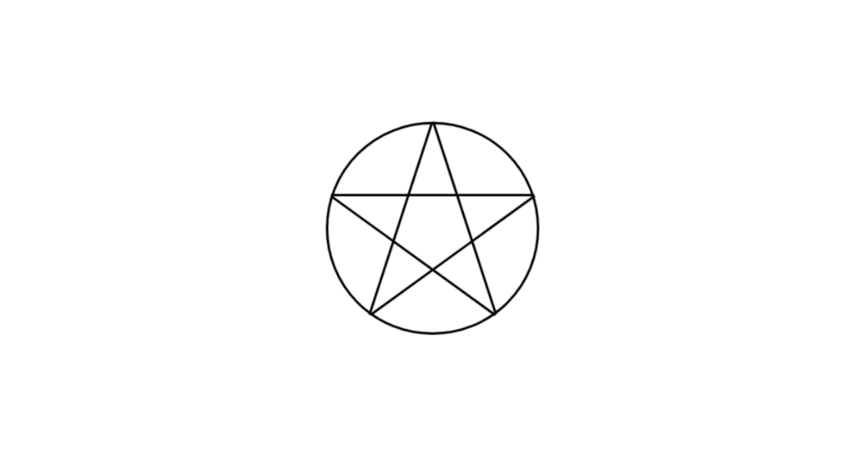
円枠なしバージョン
五芒星の円枠なしバージョンです。
HTMLには、五芒星のラインに必要な5つの子要素をdivタグで追加しています。
<div class="pentagram-1">
	<div></div>
	<div></div>
	<div></div>
	<div></div>
	<div></div>
</div>
作成した3つの要素は同じサイズの長方形で、ひとつひとつが2本の線になるように左と右にだけborderでラインを引いています。
90度回転させた状態を初期値に、それぞれを72度刻みで回転させ、positionやwidth(ラインの長さ)やheight(中心からの距離)を調節します。
.pentagram-1 {
	width: 150px;
	height: 150px;
	position: relative;
}

.pentagram-1 div {
	position: absolute;
	width: 50px;
	height: 146px;
	left: 50px;
	top: 2px;
	border-left: 2px solid #000;
	transform-origin: center;
	box-sizing: border-box;
}

.pentagram-1 div:nth-of-type(1) {
	transform: rotate(90deg);
}

.pentagram-1 div:nth-of-type(2) {
	transform: rotate(162deg);
}

.pentagram-1 div:nth-of-type(3) {
	transform: rotate(234deg);
}

.pentagram-1 div:nth-of-type(4) {
	transform: rotate(306deg);
}

.pentagram-1 div:nth-of-type(5) {
	transform: rotate(378deg);
}
五芒星の円枠付きバージョン
円枠のある五芒星をCSSで作成したバージョンです。
<div class="pentagram-2">
	<div></div>
	<div></div>
	<div></div>
	<div></div>
	<div></div>
</div>
上記の五芒星にborderで作った円を追加しています。
.pentagram-2 {
	width: 150px;
	height: 150px;
	position: relative;
	border: 2px solid #000;
	border-radius: 50%;
}

.pentagram-2 div {
	position: absolute;
	width: 50px;
	height: 146px;
	left: 50px;
	top: 2px;
	border-left: 2px solid #000;
	transform-origin: center;
	box-sizing: border-box;
}

.pentagram-2 div:nth-of-type(1) {
	transform: rotate(90deg);
}

.pentagram-2 div:nth-of-type(2) {
	transform: rotate(162deg);
}

.pentagram-2 div:nth-of-type(3) {
	transform: rotate(234deg);
}

.pentagram-2 div:nth-of-type(4) {
	transform: rotate(306deg);
}

.pentagram-2 div:nth-of-type(5) {
	transform: rotate(378deg);
}
五芒星の作り方(polygonバージョン)
clip-pathプロパティのpolygonを使った五芒星の作り方です。
See the Pen CSS | Pentagram(Polygon) by yochans (@yochans) on CodePen.
<div class="pentagram-1"></div>polygonではパーセントによる指定になりますので、要素の横幅(=編の長さ)と高さを目的の五芒星のサイズに合わせておけばOKです。
単純にwidthとheightに目的の大きさを指定します。
.pentagram-1 {
	width: 150px;
	height: 150px;
	position: relative;
	clip-path: polygon(50% 5%, 61% 40%, 98% 40%, 68% 62%, 79% 96%, 50% 75%, 21% 96%, 32% 62%, 2% 40%, 39% 40%);
	background: #4169e1;
}
polygonは指定位置を繋いだ範囲内の背景色をbackgroundで変える事ができますが、borderはclip-pathに対しては有効ではありません。
指定した位置を繋ぐ線をライン表示をするには、border分小さくしたデザインを内側に置くくらいしか方法がないかもしれません。
clip-pathを使って線の図形の描画するには、pathを利用した方が簡単です。
円で囲むには、本体に円形のborderを指定、poligon部分は疑似要素で対応可能です。(2例目)
.pentagram-2 {
	width: 150px;
	height: 150px;
	position: relative;
	border: solid 4px #4169e1;
	border-radius: 50%;
	transform-origin: center;
	box-sizing: border-box;
}

.pentagram-2::before {
	content: "";
	width: 150px;
	height: 150px;
	position: absolute;
	top: -10px;
	left: -5px;
	clip-path: polygon(50% 5%, 61% 40%, 98% 40%, 68% 62%, 79% 96%, 50% 75%, 21% 96%, 32% 62%, 2% 40%, 39% 40%);
	background: #4169e1;
}