CSSで渦巻きを作成を紹介しています。
目次
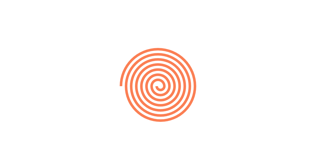
渦巻きの作り方
CSSの疑似要素、boderプロパティやrotate()の回転を利用して渦巻きを作成する方法です。
See the Pen CSS | Swirl by yochans (@yochans) on CodePen.
線の太さの違うふたつのパターン用のHTMLを作成しています。
<div class="swirl-1">
	<div></div><div></div><div></div><div></div><div></div><div></div>
</div>

<div class="swirl-2">
	<div></div><div></div><div></div><div></div><div></div><div></div><div></div><div></div><div></div><div></div>
	<div></div><div></div><div></div><div></div>
</div>
子要素のdivタグにあるborderプロパティで線の太さや色などを指定します。
子要素は全てラインのみの半円を使っています。
サンプルでは奇数指定「nth-of-type(odd)」に「transform: rotate(180deg)」として上下反転、奇数は下、偶数は上の半円を作成しています。
CSS | 半円(半月)で弧の部分にだけborderをつける方法
また、奇数時のtopは常に同じ(サンプルでは本体の高さの中心)になりますので、まとめて「nth-of-type(odd)」で設定してあります。

位置指定する数値の計算パターン
- 半円のサイズは1個毎に線の幅分を増やす
- topの指定値は、偶数毎に線の幅分を減らします(奇数は固定)
- leftの指定値は、2回ワンセットで線の幅分を減らします
数が多ければプログラムで作成するか線幅を変数にしてcalc()した方が楽かと思います。
線の太いパターン
.swirl-1 {
	width: 150px;
	height: 150px;
	position: relative;
	transform: scale(1); /* サイズ調節用 */
	transform: rotate(0deg); /* 角度調節用 */
}

.swirl-1 div {
	position: absolute;
	border: solid 10px #ff7f50;
	border-radius: 75px 75px 0 0;
	border-bottom: 0;
	box-sizing: border-box;
}

.swirl-1 div:nth-of-type(odd) {
	transform: rotate(180deg);
	top: 75px;
}

.swirl-1 div:nth-of-type(1) {
	width: 40px;
	height: 20px;
	left: 75px;
}

.swirl-1 div:nth-of-type(2) {
	width: 60px;
	height: 30px;
	top: 45px;
	left: 55px;
}

.swirl-1 div:nth-of-type(3) {
	width: 80px;
	height: 40px;
	left: 55px;
}

.swirl-1 div:nth-of-type(4) {
	width: 100px;
	height: 50px;
	top: 25px;
	left: 35px;
}

.swirl-1 div:nth-of-type(5) {
	width: 120px;
	height: 60px;
	left: 35px;
}

.swirl-1 div:nth-of-type(6) {
	width: 140px;
	height: 70px;
	top: 5px;
	left: 15px;
}
先の細いパターン
.swirl-2 {
	width: 150px;
	height: 150px;
	position: relative;
	transform: scale(1); /* サイズ調節用 */
	transform: rotate(0deg); /* 角度調節用 */
}

.swirl-2 div {
	position: absolute;
	border: solid 5px #ff7f50;
	border-radius: 75px 75px 0 0;
	border-bottom: 0;
	box-sizing: border-box;
}

.swirl-2 div:nth-of-type(odd) {
	transform: rotate(180deg);
}

.swirl-2 div:nth-of-type(odd) {
	transform: rotate(180deg);
	top: 75px;
}

.swirl-2 div:nth-of-type(1) {
	width: 20px;
	height: 10px;
	left: 70px;
}

.swirl-2 div:nth-of-type(2) {
	width: 30px;
	height: 15px;
	top: 60px;
	left: 60px;
}

.swirl-2 div:nth-of-type(3) {
	width: 40px;
	height: 20px;
	left: 60px;
}

.swirl-2 div:nth-of-type(4) {
	width: 50px;
	height: 25px;
	top: 50px;
	left: 50px;
}

.swirl-2 div:nth-of-type(5) {
	width: 60px;
	height: 30px;
	left: 50px;
}

.swirl-2 div:nth-of-type(6) {
	width: 70px;
	height: 35px;
	top: 40px;
	left: 40px;
}

.swirl-2 div:nth-of-type(7) {
	width: 80px;
	height: 40px;
	left: 40px;
}

.swirl-2 div:nth-of-type(8) {
	width: 90px;
	height: 45px;
	top: 30px;
	left: 30px;
}

.swirl-2 div:nth-of-type(9) {
	width: 100px;
	height: 50px;
	left: 30px;
}

.swirl-2 div:nth-of-type(10) {
	width: 110px;
	height: 55px;
	top: 20px;
	left: 20px;
}

.swirl-2 div:nth-of-type(11) {
	width: 120px;
	height: 60px;
	left: 20px;
}

.swirl-2 div:nth-of-type(12) {
	width: 130px;
	height: 65px;
	top: 10px;
	left: 10px;
}

.swirl-2 div:nth-of-type(13) {
	width: 140px;
	height: 70px;
	left: 10px;
}

.swirl-2 div:nth-of-type(14) {
	width: 150px;
	height: 75px;
	top: 0;
	left: 0;
}