CSSだけで作成したレスポンシブに使える夜空・星空背景のアニメーションサンプルです。
星空背景のCSSアニメーション
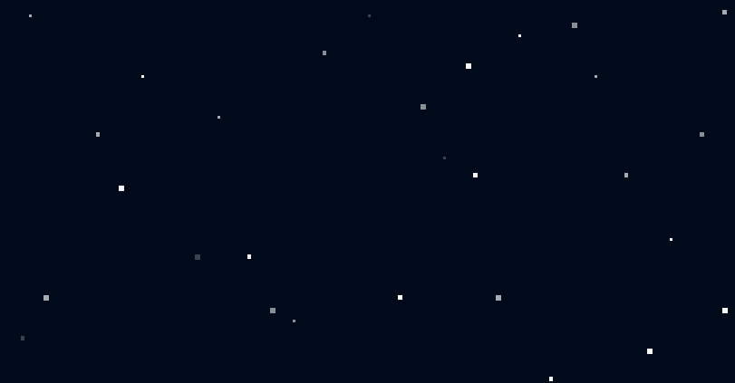
夜空に浮かぶ星々のCSSアニメーション。
アニメーションは、それぞれの星の光がゆっくりと拡縮している感じにしてあります。
See the Pen CSS | stars by yochans (@yochans) on CodePen.
星の大きさ別に各10個、「s」「m」「l」と3種類で30個の星を表現しています。
<div class="container">
	<div class="stars s">
		<p></p><p></p><p></p><p></p><p></p><p></p><p></p><p></p><p></p><p></p>
	</div>
		<div class="stars m">
		<p></p><p></p><p></p><p></p><p></p><p></p><p></p><p></p><p></p><p></p>
	</div>
		<div class="stars l">
		<p></p><p></p><p></p><p></p><p></p><p></p><p></p><p></p><p></p><p></p>
	</div>
</div>
星の色は白で指定していますが、リアル感を出すなら星別に調節したりしても良いかもしれません。
背景色はミッドナイトブルーより少し濃い色を選びました。
.container{
	position: relative;
	width: 100%;
	height: 300px;
	background: #000b1a;
}

.stars p{
	position: absolute;
	margin: 0;
	padding: 0;
	background: rgba(255, 255 ,255 , 1);
	animation: flash_anim 4s infinite;
/* 	filter: blur(1px); */
}

@keyframes flash_anim {
	0% {
		opacity: 1;
	}
	50% {
		opacity: 0.2;
	}
}
星の大きさを指定している部分。
あまり大きいと四角がわかってしまいますので、blurでぼかすとか角度調節や角丸での表現も試してみても良さそうです。
.stars.s p{
	width: 2px;
	height: 2px;
}

.stars.m p{
	width: 3px;
	height: 3px;
}

.stars.l p{
	width: 4px;
	height: 4px;
}
星の位置は大・中・小でそれぞれ横位置(left)で1(左側)~10(右側)で均等に配置、縦位置(top)はバランス取れる程度に適当な値を設定しています。
animation-delayでアニメーションの開始時間をずらす事で、光の拡縮にランダム具合を作っています。
.stars.s p:nth-of-type(1){
	top: 5%;
	left: 5%;
	animation-delay: 0;
}

.stars.s p:nth-of-type(2){
	top: 20%;
	left: 20%;
	animation-delay: 5s;
}

.stars.s p:nth-of-type(3){
	top: 30%;
	left: 30%;
	animation-delay: 8s;
}

.stars.s p:nth-of-type(4){
	top: 80%;
	left: 40%;
	animation-delay: 2s;
}

.stars.s p:nth-of-type(5){
	top: 5%;
	left: 50%;
	animation-delay: 3s;
}

.stars.s p:nth-of-type(6){
	top: 40%;
	left: 60%;
	animation-delay: 7s;
}

.stars.s p:nth-of-type(7){
	top: 10%;
	left: 70%;
	animation-delay: 9s;
}

.stars.s p:nth-of-type(8){
	top: 20%;
	left: 80%;
	animation-delay: 4s;
}

.stars.s p:nth-of-type(9){
	top: 60%;
	left: 90%;
	animation-delay: 1s;
}

.stars.s p:nth-of-type(10){
	top: 10%;
	left: 99%;
	animation-delay: 6s;
}


.stars.m p:nth-of-type(1){
	top: 84%;
	left: 4%;
	animation-delay: 7s;
}

.stars.m p:nth-of-type(2){
	top: 34%;
	left: 14%;
	animation-delay: 0s;
}

.stars.m p:nth-of-type(3){
	top: 64%;
	left: 34%;
	animation-delay: 1s;
}

.stars.m p:nth-of-type(4){
	top: 14%;
	left: 44%;
	animation-delay: 2s;
}

.stars.m p:nth-of-type(5){
	top: 74%;
	left: 54%;
	animation-delay: 9s;
}

.stars.m p:nth-of-type(6){
	top: 44%;
	left: 64%;
	animation-delay: 5s;
}

.stars.m p:nth-of-type(7){
	top: 94%;
	left: 74%;
	animation-delay: 1s;
}

.stars.m p:nth-of-type(8){
	top: 44%;
	left: 84%;
	animation-delay: 8s;
}

.stars.m p:nth-of-type(9){
	top: 34%;
	left: 94%;
	animation-delay: 6s;
}

.stars.m p:nth-of-type(10){
	top: 4%;
	left: 97%;
	animation-delay: 4s;
}


.stars.l p:nth-of-type(1){
	top: 74%;
	left: 7%;
	animation-delay: 8s;
}

.stars.l p:nth-of-type(2){
	top: 47%;
	left: 17%;
	animation-delay: 1s;
}

.stars.l p:nth-of-type(3){
	top: 64%;
	left: 27%;
	animation-delay: 7s;
}

.stars.l p:nth-of-type(4){
	top: 77%;
	left: 37%;
	animation-delay: 2s;
}

.stars.l p:nth-of-type(5){
	top: 27%;
	left: 57%;
	animation-delay: 6s;
}

.stars.l p:nth-of-type(6){
	top: 74%;
	left: 67%;
	animation-delay: 4s;
}

.stars.l p:nth-of-type(7){
	top: 7%;
	left: 77%;
	animation-delay: 2s;
}

.stars.l p:nth-of-type(8){
	top: 87%;
	left: 87%;
	animation-delay: 5s;
}

.stars.l p:nth-of-type(9){
	top: 77%;
	left: 97%;
	animation-delay: 9s;
}

.stars.l p:nth-of-type(10){
	top: 17%;
	left: 63%;
	animation-delay: 1s;
}