CSSのtext-shadow()を使ったテキストが凹んでいるように見えるCSSテキストデザイン集です。
以前の記事ではフォントサイズ、シャドーなどにremを指定していましたが、この記事ではpxで指定しています。
フォントサイズに合わせて調節して下さい。
共通HTML
このページのサンプルで利用している共通のHTMLコードです。
主に背景色を指定している「.container{}」とテキスト部分の「.text{}」となっています。
<div class="container">
	<p class="text">ONE NOTES</p>
</div>ノーマルタイプ
基本的な凹んだ感じになるCSSデザインです。
カラーバリエーションでいくつか紹介していますが、基本的なCSSコードは同じです。
「.container{}」のbackgroundを変更することで全体の配色を変えることができます。
ノーマル01
See the Pen CSS CSS Sunken Text 01 by yochans (@yochans) on CodePen.
.container {
	display:flex;
	justify-content: center;
	align-items: center;
	height: 220px;
	background: #FFF;
}

.text {
	padding: 20px 0;
	margin: 0px;
	font-size: 70px;
	font-weight: bold;
	color: transparent;
	background: #000;
	text-shadow: 2px 2px 3px rgba( 255, 255, 255, 0.5);
	background-clip: text;
	-webkit-background-clip: text;
}
ノーマル02
See the Pen CSS CSS Sunken Text 02 by yochans (@yochans) on CodePen.
.container {
	display:flex;
	justify-content: center;
	align-items: center;
	height: 220px;
	background: #FFF;
}

.text {
	font-size: 70px;
	font-weight: bold;
	color: transparent;
	background: #000;
	text-shadow: 2px 2px 3px rgba( 255, 255, 255, 0.95);
	background-clip: text;
	-webkit-background-clip: text;
}
ノーマル03
See the Pen CSS CSS Sunken Text 03 by yochans (@yochans) on CodePen.
.container {
	display:flex;
	justify-content: center;
	align-items: center;
	height: 220px;
	background: #313131;
}

.text {
	font-size: 70px;
	font-weight: bold;
	color: transparent;
	background: #000;
	text-shadow: 2px 2px 1px rgba( 255, 255, 255, 0.5);
	background-clip: text;
	-webkit-background-clip: text;
}
ノーマル04
See the Pen CSS CSS Sunken Text 04 by yochans (@yochans) on CodePen.
.container {
	display:flex;
	justify-content: center;
	align-items: center;
	height: 220px;
	background: #FFF;
}

.text {
	font-size: 70px;
	font-weight: bold;
	color: transparent;
	background: #000;
	text-shadow: 1px 1px 2px rgba( 255, 255, 255, 5);
	background-clip: text;
	-webkit-background-clip: text;
}
ノーマル05
See the Pen CSS CSS Sunken Text 05 by yochans (@yochans) on CodePen.
.container{
	display:flex;
	justify-content: center;
	align-items: center;
	height: 220px;
	background: #FFCDD2;
}

.text {
	font-size: 70px;
	font-weight: bold;
	color: transparent;
	background: #000;
	text-shadow: 1px 1px 2px rgba( 255, 205, 210, .95);
	background-clip: text;
	-webkit-background-clip: text;
}
ノーマル06
See the Pen CSS CSS Sunken Text 06 by yochans (@yochans) on CodePen.
.container{.container{
	display:flex;
	justify-content: center;
	align-items: center;
	height: 220px;
	background: #B9F6CA;
}

.text {
	font-size: 70px;
	font-weight: bold;
	color: transparent;
	background: #000;
	text-shadow: 1px 1px 2px rgba( 185,	246,	202, .90);
	background-clip: text;
	-webkit-background-clip: text;
}
ノーマル07
See the Pen CSS CSS Sunken Text 07 by yochans (@yochans) on CodePen.
.container{
display:flex;
justify-content: center;
align-items: center;
height: 220px;
background: #81D4FA;
}
.text {
font-size: 70px;
font-weight: bold;
color: transparent;
background: #000;
text-shadow: 1px 1px 2px rgba( 129, 212, 250, .95);
background-clip: text;
-webkit-background-clip: text;
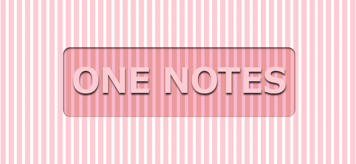
}ストライプタイプ
repeating-linear-gradient()で表現したストライプを使ったサンプルコードです。
色の濃さを少しずつ変えて、凹み感を演出しています。
「.container{}」のrepeating-linear-gradient()の2色、「.text{}」のrepeating-linear-gradient()の2色がストライプの色となっています。
ストライプの角度はrepeating-linear-gradient()にて指定されているdegを調節するこどで変更できます。
degはそのまま角度を指していて、0~360(※)で指定可能。
※アニメーションでも利用可能で、360以上も指定可能です。
ストライプ01
See the Pen CSS CSS Sunken Text 07 by yochans (@yochans) on CodePen.
.container{
	display:flex;
	justify-content: center;
	align-items: center;
	height: 220px;
	padding: 0;
	margin: 0;
	background: repeating-linear-gradient( 45deg, #FFF 0px 10px, #9E9E9E 10px 28px );
}

.text {
	font-size: 70px;
	font-weight: bold;
	color: transparent;
	background: repeating-linear-gradient( 45deg, #BDBDBD 0 10px, #424242 10px 28px );
	text-shadow: 1px 1px 2px rgba( 255, 255, 255, .3);
	background-clip: text;
	-webkit-background-clip: text;
}
ストライプ02
See the Pen CSS CSS Sunken Text STRIPE02 by yochans (@yochans) on CodePen.
.container{
	display:flex;
	justify-content: center;
	align-items: center;
	height: 220px;
	padding: 0;
	margin: 0;
	background: repeating-linear-gradient( 45deg, #FFF 0px 10px, #FFCDD2 10px 28px );
}

.text {
	font-size: 70px;
	font-weight: bold;
	color: transparent;
	background: repeating-linear-gradient( 45deg, #F8BBD0 0 10px, #EF9A9A 10px 28px );
	text-shadow: 1px 1px 2px rgba( 255, 255, 255, .4);
	background-clip: text;
	-webkit-background-clip: text;
}
ストライプ03
See the Pen CSS CSS Sunken Text STRIPE03 by yochans (@yochans) on CodePen.
.container{
	display:flex;
	justify-content: center;
	align-items: center;
	height: 220px;
	padding: 0;
	margin: 0;
	background: repeating-linear-gradient( 45deg, #FFF 0px 10px, #81D4FA 10px 28px );
}

.text {
	font-size: 70px;
	font-weight: bold;
	color: transparent;
	background: repeating-linear-gradient( 45deg, #81D4FA 0 10px, #039BE5 10px 28px );
	text-shadow: 1px 1px 2px rgba( 255, 255, 255, .4);
	background-clip: text;
	-webkit-background-clip: text;
}
ストライプ04
See the Pen CSS CSS Sunken Text STRIPE04 by yochans (@yochans) on CodePen.
.container{
	display:flex;
	justify-content: center;
	align-items: center;
	height: 220px;
	padding: 0;
	margin: 0;
	background: repeating-linear-gradient( 45deg, #FFF 0px 10px, #B9F6CA 10px 28px );
}

.text {
	font-size: 70px;
	font-weight: bold;
	color: transparent;
	background: repeating-linear-gradient( 45deg, #C8E6C9 0 10px, #66BB6A 10px 28px );
	text-shadow: 1px 1px 2px rgba( 255, 255, 255, .4);
	background-clip: text;
	-webkit-background-clip: text;
}
凹凸タイプ
テキストの周りが凹んでいて、テキストはそこから出ているイメージで作成した凹凸タイプのCSSデザインです。
「.text{}」のbox-shadow()がテキストを中心に凹んでいる部分の影、text-shadow()でテキスト本体の立体感を出しています。
「.text{}」のpaddingで凹んでいる部分のサイズを調整、border-radiusで角の丸みを調整できます。
凹凸01
See the Pen CSS Sunken Text OUTOTU 01 by yochans (@yochans) on CodePen.
.container{
	display:flex;
	justify-content: center;
	align-items: center;
	height: 220px;
	background: #FFF;
}

.text {
	padding: 16px;
	font-size: 70px;
	font-weight: bold;
	color: #FFF;
	border-radius: 25px;
	text-shadow: 1px 6px 5px rgba( 0, 0, 0, 0.8);
 	box-shadow: inset 1px 3px 6px rgba( 0, 0, 0, 0.9);
}
凹凸02
See the Pen CSS Sunken Text OUTOTU 02 by yochans (@yochans) on CodePen.
.container{
	display:flex;
	justify-content: center;
	align-items: center;
	height: 220px;
	background: #FFCDD2;
}

.text {
	padding: 16px;
	font-size: 70px;
	font-weight: bold;
	color: #FFCDD2;
	border-radius: 25px;
	background: #FFEBEE;
	text-shadow: 1px 6px 5px rgba( 0, 0, 0, 0.8);
	box-shadow: inset 1px 3px 6px rgba( 0, 0, 0, 0.9);
}
凹凸03
See the Pen CSS Sunken Text OUTOTU 02 by yochans (@yochans) on CodePen.
.container{
	display:flex;
	justify-content: center;
	align-items: center;
	height: 220px;
	background: #B9F6CA;
}

.text {
	padding: 16px;
	font-size: 70px;
	font-weight: bold;
	color: #B9F6CA;
	border-radius: 25px;
	background: #C8E6C9;
	text-shadow: 1px 6px 5px rgba( 0, 0, 0, 0.8);
	box-shadow: inset 1px 3px 6px rgba( 0, 0, 0, 0.9);
}
凹凸04
See the Pen CSS Sunken Text OUTOTU 04 by yochans (@yochans) on CodePen.
.container{
	display:flex;
	justify-content: center;
	align-items: center;
	height: 220px;
	background: #81D4FA;
}

.text {
	padding: 16px;
	font-size: 70px;
	font-weight: bold;
	color: #81D4FA;
	border-radius: 25px;
	background: #B3E5FC;
	text-shadow: 1px 6px 5px rgba( 0, 0, 0, 0.8);
	box-shadow: inset 1px 3px 6px rgba( 0, 0, 0, 0.9);
}
凹凸&ストライプタイプ
凹凸タイプとストライプタイプを合わせたパターンです。
凹んでいる部分に濃い色のストライプを入れることで、それっぽくなったのではないかと思います。
テキスト部分をストライプにするには、疑似要素かHTMLの追加が必要そうだったので諦めました。
ストライプの角度はrepeating-linear-gradient()にて指定されているdegを調節するこどで変更できます。
degはそのまま角度を指していて、0~360(※)で指定可能。
※アニメーションでも利用可能で、360以上も指定可能です。
凹凸&ストライプ01
See the Pen CSS Sunken Text OUTOTU & STRIPE 01 by yochans (@yochans) on CodePen.
.container{
	display:flex;
	justify-content: center;
	align-items: center;
	height: 220px;
	background: repeating-linear-gradient( 90deg, #FFF 0px 10px, #9E9E9E 10px 28px );

}

.text {
	padding: 16px;
	font-size: 70px;
	font-weight: bold;
	color: #FFF;
	border-radius: 25px;
	background: repeating-linear-gradient( 90deg, #9E9E9E 0 11px, #424242 10px 28px );
	text-shadow: 1px 6px 5px rgba( 0, 0, 0, 0.8);
	box-shadow: inset 1px 3px 6px rgba( 0, 0, 0, 0.9);
}
凹凸&ストライプ02
See the Pen CSS Sunken Text OUTOTU & STRIPE 02 by yochans (@yochans) on CodePen.
.container{
	display:flex;
	justify-content: center;
	align-items: center;
	height: 220px;
	background: repeating-linear-gradient( 90deg, #FFF 0px 10px, #FFCDD2 10px 28px );

}

.text {
	padding: 16px;
	font-size: 70px;
	font-weight: bold;
	color: #FFCDD2;
	border-radius: 25px;
	background: repeating-linear-gradient( 90deg, #F8BBD0 0 11px, #EF9A9A 10px 28px );
	text-shadow: 1px 6px 5px rgba( 0, 0, 0, 0.8);
	box-shadow: inset 1px 3px 6px rgba( 0, 0, 0, 0.9);
}
凹凸&ストライプ03
See the Pen CSS Sunken Text OUTOTU & STRIPE 03 by yochans (@yochans) on CodePen.
.container{
	display:flex;
	justify-content: center;
	align-items: center;
	height: 220px;
	background: repeating-linear-gradient( 90deg, #FFF 0px 10px, #81D4FA 10px 28px );

}

.text {
	padding: 16px;
	font-size: 70px;
	font-weight: bold;
	color: #81D4FA;
	border-radius: 25px;
	background: repeating-linear-gradient( 90deg, #81D4FA 0 11px, #039BE5 10px 28px );
	text-shadow: 1px 6px 5px rgba( 0, 0, 0, 0.8);
	box-shadow: inset 1px 3px 6px rgba( 0, 0, 0, 0.9);
}
凹凸&ストライプ04
See the Pen CSS Sunken Text OUTOTU & STRIPE 04 by yochans (@yochans) on CodePen.
.container{
	display:flex;
	justify-content: center;
	align-items: center;
	height: 220px;
	background: repeating-linear-gradient( 90deg, #FFF 0px 10px, #B9F6CA 10px 28px );

}

.text {
	padding: 16px;
	font-size: 70px;
	font-weight: bold;
	color: #B9F6CA;
	border-radius: 25px;
	background: repeating-linear-gradient( 90deg, #C8E6C9 0 11px, #66BB6A 10px 28px );
	text-shadow: 1px 6px 5px rgba( 0, 0, 0, 0.8);
	box-shadow: inset 1px 3px 6px rgba( 0, 0, 0, 0.9);
}
画像タイプ
画像01
動画を背景にした凹みテキストを作ってみました。
テキストの色を透過することで背景の画像を消さないようにしています。
See the Pen CSS CSS Sunken Text IMAGE 01 by yochans (@yochans) on CodePen.
.container{
	display:flex;
	justify-content: center;
	align-items: center;
	height: 220px;
	background: url(https://1-notes.com/wp-content/uploads/2020/09/sofa.jpg) no-repeat center center/cover;
}

.text {
	font-size: 70px;
	font-weight: bold;
	color: transparent;
	background: transparent;
	text-shadow: -1px -1px 1px rgba( 0, 0, 0, .6),	1px 1px 2px rgba( 255, 255, 255, .3);
	background-clip: text;
	-webkit-background-clip: text;
}
画像02
テキストの背景にマスク画像を使って立体的にみせているCSSサンプルになります。
「凹んでいる」とは言えないかもですが、shadow()をもっと上手く使えれれば・・・
See the Pen CSS CSS Sunken Text 03 by yochans (@yochans) on CodePen.
.container{
	display:flex;
	justify-content: center;
	align-items: center;
	background: #546E7A;
}

.text {
	font-size: 70px;
	font-weight: bold;
	color: transparent;
	background: #000;
	background: url(https://1-notes.com/wp-content/uploads/2020/09/sofa.jpg) no-repeat center center/cover;
	text-shadow: 1px  1px 3px rgba( 255, 255, 255, 0.1);
	background-clip: text;
	-webkit-background-clip: text;
	animation : bg 20s linear infinite;
}

@keyframes bg {
	0% { background-position: center top }
	100% { background-position: center bottom }
}