CSSでテキストに蛍光ペン、蛍光マーカーを付けたCSSデザインサンプルの紹介です。
蛍光ペンのCSSデザインサンプル集
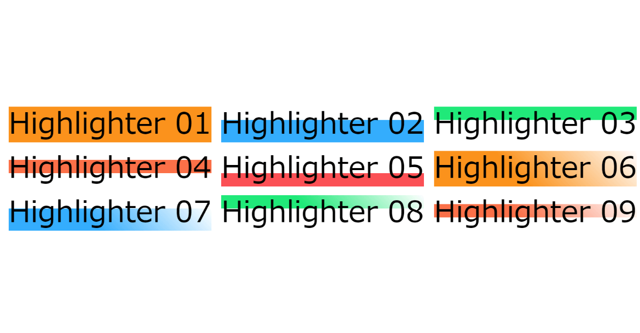
蛍光ペンでマーカーを付けてハイライト表示するテキストのCSSデザインサンプル集です。
全体、上段、中断、下段とグラデーションでフェードアウトされたパターンを用意しました。
See the Pen CSS | Flipped horizontally text design 02 by yochans (@yochans) on CodePen.
共通HTML
<span class="highlighter">SAMPLE</span>サンプル 01
.highlighter {
	background: linear-gradient(transparent 10%, #FF9100 10% 90%, transparent 90%);
}
サンプル 02
.highlighter {
	background: linear-gradient(transparent 40%, #00B0FF 40% 90%, transparent 90%);
}
サンプル 03
.highlighter {
	background: linear-gradient(transparent 10%, #00E676 10% 40%, transparent 40%);
}
サンプル 04
.highlighter {
	background: linear-gradient(transparent 30%, #FF7043 30% 60%, transparent 60%);
}
サンプル 05
.highlighter {
	background: linear-gradient(transparent 60%, #FF5252 60% 90%, transparent 90%);
}
サンプル 06
.highlighter {
	position: relative;
}

.highlighter::before {
	content: "";
	width: 100%;
	height: 80%;
	position: absolute;
	top: 10%;
	left: 0;
	background: linear-gradient(45deg, transparent 0%, #FF9100 0% 40%, transparent 100%);
	z-index: -1;
}
サンプル 07
.highlighter {
	position: relative;
}

.highlighter::before {
	content: "";
	width: 100%;
	height: 50%;
	position: absolute;
	top: 40%;
	left: 0;
	background: linear-gradient(45deg, transparent 0%, #00B0FF 0% 40%, transparent 100%);
	z-index: -1;
}
サンプル 08
.highlighter {
	position: relative;
}

.highlighter::before {
	content: "";
	width: 100%;
	height: 30%;
	position: absolute;
	top: 10%;
	left: 0;
	background: linear-gradient(45deg, transparent 0%, #00E676 0% 40%, transparent 100%);
	z-index: -1;
}
サンプル 09
.highlighter {
	position: relative;
}

.highlighter::before {
	content: "";
	width: 100%;
	height: 30%;
	position: absolute;
	top: 30%;
	left: 0;
	background: linear-gradient(45deg, transparent 0%, #FF7043 0% 40%, transparent 100%);
	z-index: -1;
}
サンプル 10
.highlighter {
	position: relative;
}

.highlighter::before {
	content: "";
	width: 100%;
	height: 30%;
	position: absolute;
	top: 55%;
	left: 0;
	background: linear-gradient(45deg, transparent 0%, #FF5252 0% 40%, transparent 100%);
	z-index: -1;
}