ポタポタと雫が落ちるCSSアニメーションを作成しましたのでサンプルを紹介していきます。
完全に余談ですが「雫」は英語で「drop」ですし日本語での意味も「水や液体のしたたり。」とある。
これは「雫」の時点で既に「落ちる」という意味もあって「雫が落ちる」というタイトル付けは間違っているという事なのか・・・?
では「水滴」の方が適任なのかなと考えましたが、「水滴」の意味は「水のしたたり。しずく。」と意味の説明があった。
「水滴」も既に落ちてるじゃん(それもそうか)。
英語でも「drop drop」とはならないですし「Water drop」はわかるけど葉っぱとかに付いている状態の落ちてはいない雫・水滴はどう表現するでしょうか。
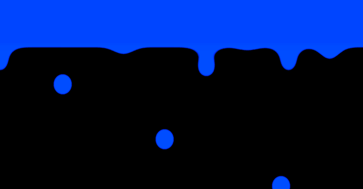
雫が落ちるCSSアニメーション
雫・水滴が落ちるCSSアニメーションのサンプルです。
See the Pen CSS | Water drops animation 1 by yochans (@yochans) on CodePen.
HTMLには「.container」「.blend-area」と2つの親要素を持たしています。
これは「.blend-area」にて背景色もぼかしがかかってしまうため、「.container」の背景色も同色を指定してごまかしている為です。
あと、雫の色がどうしても指定した値を変わって表示されてしまうので「.container」で色調整をしています。
水滴、雫は「.drop」としました。
上部に雫と同じ色のバー「.bar」を置いています。
ほかにも方法はありますが、水滴がよりそれっぽく落ちる為には重なり合う何かが必要です。
<div class="container">
	<div class="blend-area">
		<div class="drop"></div>
		<div class="bar"></div>
	</div>
</div>「.container」にある「filterプロパティ」は色調整用です。
「hue-rotate()」で色を変え、「brightness()」で輝度を調整しています。
「.blend-area」では「filterプロパティ」の「blur()」でぼかし、「contrast()」でコントラストを調整してぼかしを制御しています。
「contrast()」は%指定が多いですが1を100%とした0からの数値でも指定可能です。
この手のスタイル指定ではよく見る「2000%」にあたる「20」を指定しています。
雫部分になる「.drop」には特別重要なプロパティは指定していません。
円ですが、それっぽく見せるために少し縦長の楕円としてみました。
バー部分と雫が離れる瞬間までの時間がアニメーション時間の90%を締めています。
90%の時に落下になりますが、どの位置で切り離して落下状態にするかは好みに調節して下さい。
.container {
	position: relative;
	background: #000;
	width: 100%;
	height: 300px;
	filter: hue-rotate(330deg) brightness(200%);
}

.blend-area {
	width: 100%;
	height: 100%;
	filter: blur(10px) contrast(20);
	background: #000;
	overflow: hidden;

}

.bar {
	position: absolute;
	width: 100%;
	height: 20px;
	background: #4169e1;
}

.drop {
	position: absolute;
	left: calc(50% - 25px);
	width: 50px;
	height: 60px;
	border-radius: 50%;
	background: #4169e1;
	animation: drop-anim 3s linear infinite;
}


@keyframes drop-anim {
	0% {
		top: -25px;
		transform: scale(0.2);
	}

	90% {
		top: 30px;
		transform: scale(1);
	}

	100% {
		top: 100%;
		transform: scale(1);
	}
}
沢山の雫が落ちるCSSアニメーション
雫の数を増やしてみた雫・水滴が落ちるCSSアニメーションバージョンです。
沢山と書いていますが、ちょっと用事があり10個と少なめです。
20個くらいに増やして、サイズの種類も作って、などもっと良くなる可能性はあります。
ただ、色に関しては増やすのは大変だと思います。
色については下記で紹介しておきます。
See the Pen CSS | Water drops animation 1 by yochans (@yochans) on CodePen.
雫部分を「.drops」として子要素に10個の雫「div」を設置しました。
<div class="container">
	<div class="blend-area">
		<div class="drops">
		<div></div><div></div><div></div><div></div><div></div>
		<div></div><div></div><div></div><div></div><div></div>
	</div>
		<div class="bar"></div>
		</div>
</div>
雫がひとつだけのバージョンと殆ど同じです。
「nth-child()」で雫毎に横軸の位置とアニメーション開始の遅延を設定しています。
表示する雫のサイズを「transform: scale()」で変化させていますが、最大値を0.6として小さくしています。
.container {
	position: relative;
	background: #000;
	width: 100%;
	height: 300px;
	filter: hue-rotate(330deg) brightness(200%);
}

.blend-area {
	width: 100%;
	height: 100%;
	filter: blur(10px) contrast(20);
	background: #000;
	overflow: hidden;
}

.bar {
	position: absolute;
	width: 100%;
	height: 20px;
	background: #4169e1;
}

.drops div {
	position: absolute;
	top: -50px;
	width: 50px;
	height: 60px;
	border-radius: 50%;
	background: #4169e1;
/* 	transform: translateX(-25px); */
	animation: drop-anim 3s linear infinite;
}

.drops div:nth-child(1) {
	left: calc(5% - 25px);
	animation-delay: 0.3s;
}

.drops div:nth-child(2) {
	left: calc(15% - 25px);
	animation-delay: 2.1s;
}

.drops div:nth-child(3) {
	left: calc(25% - 25px);
	animation-delay: 1.8s;
}

.drops div:nth-child(4) {
	left: calc(35% - 25px);
	animation-delay: 1.2s;
}

.drops div:nth-child(5) {
	left: calc(45% - 25px);
	animation-delay: 2.7s;
}

.drops div:nth-child(6) {
	left: calc(55% - 25px);
	animation-delay: 0s;
}

.drops div:nth-child(7) {
	left: calc(65% - 25px);
	animation-delay: 1.5s;
}

.drops div:nth-child(8) {
	left: calc(75% - 25px);
	animation-delay: 0.3s;
}

.drops div:nth-child(9) {
	left: calc(85% - 25px);
	animation-delay: 0.9s;
}

.drops div:nth-child(10) {
	left: calc(95% - 25px);
	animation-delay: 2.4s;
}


@keyframes drop-anim {
	0% {
		top: -30px;
		transform: scale(0.2);
	}

	90% {
		top: 15px;
		transform: scale(0.6);
	}

	100% {
		top: 100%;
		transform: scale(0.6);
	}
}
白背景バージョン
See the Pen CSS | Water drops animation 2 by yochans (@yochans) on CodePen.
<div class="container">
	<div class="drops">
		<div></div><div></div><div></div><div></div><div></div>
		<div></div><div></div><div></div><div></div><div></div>
	</div>
	<div class="bar1"></div>
	<div class="bar2"></div>
</div>
.container {
position: relative;
background: #FFF;
width: 100%;
height: 300px;
filter: contrast(20); /* ぼかしを相殺 */
}
/* .blend-area {
width: 100%;
height: 100%;
background: #FFF;
overflow: hidden;
} */
.bar1 {
position: absolute;
width: 100%;
height: 20px;
background: #00ffff;
filter: blur(10px); /* 雫のサイズにより拡縮 */
}
.bar2 {
position: absolute;
width: 100%;
height: 20px;
background: #00ffff;
}
.drops div {
position: absolute;
top: -50px;
width: 55px;
height: 70px;
border-radius: 50%;
background: #00ffff;
filter: blur(10px); /* 雫のサイズにより拡縮 */
animation: drop-anim 3s linear infinite;
}
.drops div:nth-child(1) {
left: calc(5% - 25px);
animation-delay: 0.3s;
}
.drops div:nth-child(2) {
left: calc(15% - 25px);
animation-delay: 2.1s;
}
.drops div:nth-child(3) {
left: calc(25% - 25px);
animation-delay: 1.8s;
}
.drops div:nth-child(4) {
left: calc(35% - 25px);
animation-delay: 1.2s;
}
.drops div:nth-child(5) {
left: calc(45% - 25px);
animation-delay: 2.7s;
}
.drops div:nth-child(6) {
left: calc(55% - 25px);
animation-delay: 0s;
}
.drops div:nth-child(7) {
left: calc(65% - 25px);
animation-delay: 1.5s;
}
.drops div:nth-child(8) {
left: calc(75% - 25px);
animation-delay: 0.3s;
}
.drops div:nth-child(9) {
left: calc(85% - 25px);
animation-delay: 0.9s;
}
.drops div:nth-child(10) {
left: calc(95% - 25px);
animation-delay: 2.4s;
}
@keyframes drop-anim {
0% {
top: -30px;
transform: scale(0.25);
}
80% {
top: 15px;
transform: scale(0.65);
}
100% {
top: 100%;
transform: scale(0.65);
}
}
初めまして。いろいろ試してみたのですが、どうしても背景色を白にした上で淡い水色の雫にすることができませんでした。背景を白にした場合、やはりネオン系のカラーにすることしかできませんか?
コメントありがとうございます。
雫のやつですね。確か自分も白背景バージョンも目指したのですが、全然上手くできなかった記憶があります・・・
何か方法があるかも知れませんが、見つからずでした。色については下記にって、見たらどこにも書いてないすし、、
お役に立てず申し訳ございません。
再チャレンジしてみますので、少しだけ時間下さいっ