CSS | display:flexのgapで要素間の余白を指定する方法
CSSのflexbox(display:flex)でgapを利用して並べる要素間の余白・間隔を指定する方法を紹介しています。
See the Pen CSS flexbox gap by yochans (@yochans) on CodePen.
gapで要素間の余白を指定する
gapは親要素に対して指定し、これはrow-gapとcolumn-gapの一括指定です。
余白幅・間隔を同じにする場合は2つ目の指定は省略可能です。
値にはpxや%、em、vminなどが指定可能となっています。
#container {
	display: flex; /* flexbox */
	flex-wrap: wrap; /* 折返し指定 */
	gap: 6px 4px; /* 余白 */
}
flexboxの並びがデフォルトの横向きの場合、1つ目の指定で縦列の余白、2つ目の指定で横列の余白・間隔となるので注意して下さい。
gapとmarginの違い
並べる要素の余白はmarginでも指定可能ですが、gapで指定した場合は外側の余白は設定されません。
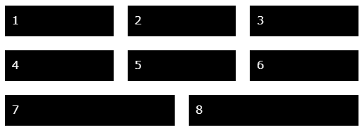
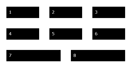
用途にもよりますが、gap指定の方がスペースを有効に使える可能性が高いかも知れません。
[…] flexとgap […]
これ知らなかったです・・・
Webの仕事してるのに・・・
CSS2の人間なので3は使わないとマジで知らない子います。
助かりました。