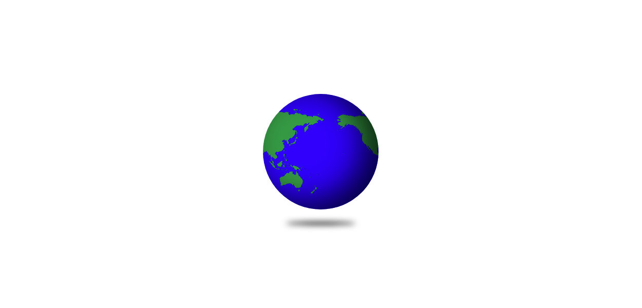
CSSで立体感のある地球儀を作成する方法を紹介しています。
See the Pen CSS | Globe by yochans (@yochans) on CodePen.
シンプルな球体の作り方について、以下記事でも紹介しています。
CSS | 3Dな球体の作り方2
地球儀の作り方
HTML構造
動作サンプルで紹介している地球儀に使っているHTML構造です。
<div class="globe"></div>円と地図
円を作成して、背景に世界地図の画像ファイルを指定、地図の画像は2つ分繋げています。
background-sizeで「auto 100%」と指定して要素サイズに画像の高さを合わせます。
.globe {
	width: 150px;
	height: 150px;
	margin: 30px;
	border-radius: 50%;
	position: relative;
	background: url('https://raw.githubusercontent.com/Yousuke777/texture/main/blob.png') repeat-x;
	background-size: auto 100%;
	box-shadow: -20px -10px 40px rgba(0, 0, 0, .75) inset;
	animation: rotate-anim 50s linear infinite;
}
影
円を球に見せるための立体感を出すために、box-shadowで影を付けています。
box-shadowにinsetを指定する事で外側ではなく内側に影を付けています。
box-shadow: -20px -10px 40px rgba(0, 0, 0, .75) inset;地球儀の下側に浮いている感じの影をafterにて作成していますが不要な場合も多そうです。
こちらはfilterのblur()で円を影にしています。
bottomで高さの位置を調節します。
.globe:after {
	content: "";
	position: absolute;
	left: 0;
	right: 0;
	bottom: -20px;
	margin: auto;
	width: 90px;
	height: 4px;
	border-radius: 50%;
	background: #000;
	filter: blur(4px);
}
回転アニメーションの追加
地球儀を回転させる用のアニメーションを追加します。
回転といっても実際は、円の上に表示している地図画像がシームレスに移動しているだけです。
background-positionの指定は速度に影響が出るだけですので、画像の横幅などをpxで記述するとか、パーセント指定でも構いません。
@keyframes rotate-anim {
	100% {
		background-position: -200% 0;
	}
}
地球儀のサンプルCSSコード
3Dな地球儀の動作サンプルで使っているCSSの全体コードです。
HTMLは上記してあるものと同じです。
.globe {
	width: 150px;
	height: 150px;
	margin: 30px;
	border-radius: 50%;
	position: relative;
	background: url('https://1-notes.com/wp-content/uploads/2021/06/world-map.png') repeat-x;
	background-size: auto 100%;
	animation: rotate-anim 50s linear infinite;
	box-shadow: -20px -10px 40px rgba(0, 0, 0, .75) inset;
}

.globe:after {
	content: "";
	position: absolute;
	left: 0;
	right: 0;
	bottom: -20px;
	margin: auto;
	width: 90px;
	height: 4px;
	border-radius: 50%;
	background: #000;
	filter: blur(4px);
}

@keyframes rotate-anim {
	100% {
		background-position: -200% 0;
	}
}
[…] CSS | 3D globe design | ONE NOTES […]