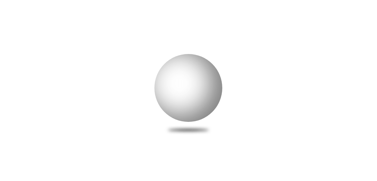
CSSで円に影を付けて立体的な球体を作成する方法です。
See the Pen CSS | 3D Sphere 2 by yochans (@yochans) on CodePen.
transform-styleのpreserve-3dを使った3D球体の作り方は以下記事でも紹介していますので宜しければ。
CSS | 3Dな球体の作り方1
立体的な球体を作成する方法
HTML構造
<div class="sphere"></div>円を作成する
正方形サイズの要素をborder-radiusで丸めてシンプルな円を作成します。
背景色は白色を指定していますので、影を付けていない状態では確認する事ができません。
.sphere {
	width: 150px;
	height: 150px;
	margin: 50px 30px;
	border-radius: 50%;
	position: relative;
	background: #FFF;
	box-shadow: -20px -10px 50px 5px rgba(0, 0, 0, .5) inset;
}
影を付ける
立体感を出すためにbox-shadowで色を付けています。
box-shadowはinsetを指定する事で内側に影を付ける事ができます。
更に深く影を付ける場合など、同じサイズの無色の円を擬似要素のbeforeや子要素などで作成して影用にして、本体と分けても良いかも知れません。
box-shadow: -20px -10px 50px 5px rgba(0, 0, 0, .5) inset;疑似要素のafterを使って、球体から伸びる影を作成しています。
こちらの影はfilterのblur(ぼかし)で作ってみました。
アニメーションを指定したりで本体と重なった時用に、z-index(z軸の深度)を指定していますが重ねない場合は不要です。
.sphere:after {
	content: "";
	position: absolute;
	left: 0;
	right: 0;
	bottom: -20px;
	margin: auto;
	width: 90px;
	height: 4px;
	border-radius: 50%;
	background: #000;
	filter: blur(4px);
	z-index: -1;
}
球体のサンプルCSSコード
球体の動作サンプルで使っているCSSの全体コードです。
HTMLは上記してあるものと同じです。
.sphere {
	width: 150px;
	height: 150px;
	margin: 50px 30px;
	border-radius: 50%;
	position: relative;
	background: #FFF;
	box-shadow: -20px -10px 50px 5px rgba(0, 0, 0, .5) inset;
}

.sphere:after {
	content: "";
	position: absolute;
	left: 0;
	right: 0;
	bottom: -20px;
	margin: auto;
	width: 90px;
	height: 4px;
	border-radius: 50%;
	background: #000;
	filter: blur(4px);
	z-index: -1;
}