CSSでtransform-styleのpreserve-3dを使って、3Dな球体を作成する方法を紹介しています。
See the Pen CSS | 3D Sphere by yochans (@yochans) on CodePen.
円に影をつけて立体的にする球体の作り方については以下の記事にて紹介しています。
CSS | 3Dな球体の作り方2
3D球体の作り方
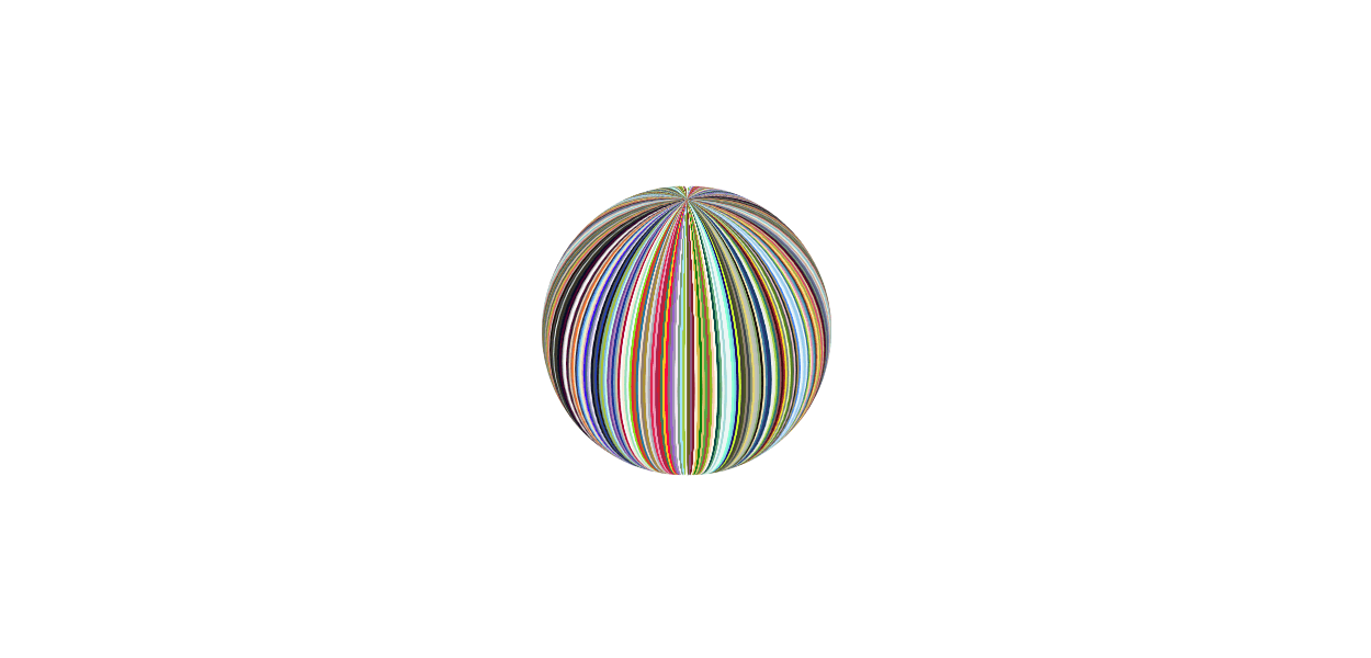
「transform-style」に「preserve-3d」を指定して作った立体的な球体の作成手順です。
CSSの3D描写での球体は、他にもborderを使ったり、数の多い多面体を作成して球体にみせる方法などもあります。
また、CSSで作成する球体は、円に光や影を付けて立体的にみせるケースの方が有力ですし一般的ですが、宜しければ遊んでみて下さい。
- コンテナ
- 外面群
HTML
複数の円を360度設置していますので、その数だけの子要素が必要となります。
サンプルでは1pxずつずらした180個の円にするdivタグ(1行10個の18行)を記述しています。
<div class="shape">
	<div></div><div></div><div></div><div></div><div></div><div></div><div></div><div></div><div></div><div></div>
	<div></div><div></div><div></div><div></div><div></div><div></div><div></div><div></div><div></div><div></div>
	<div></div><div></div><div></div><div></div><div></div><div></div><div></div><div></div><div></div><div></div>
	<div></div><div></div><div></div><div></div><div></div><div></div><div></div><div></div><div></div><div></div>
	<div></div><div></div><div></div><div></div><div></div><div></div><div></div><div></div><div></div><div></div>
	<div></div><div></div><div></div><div></div><div></div><div></div><div></div><div></div><div></div><div></div>
	<div></div><div></div><div></div><div></div><div></div><div></div><div></div><div></div><div></div><div></div>
	<div></div><div></div><div></div><div></div><div></div><div></div><div></div><div></div><div></div><div></div>
	<div></div><div></div><div></div><div></div><div></div><div></div><div></div><div></div><div></div><div></div>
	<div></div><div></div><div></div><div></div><div></div><div></div><div></div><div></div><div></div><div></div>
	<div></div><div></div><div></div><div></div><div></div><div></div><div></div><div></div><div></div><div></div>
	<div></div><div></div><div></div><div></div><div></div><div></div><div></div><div></div><div></div><div></div>
	<div></div><div></div><div></div><div></div><div></div><div></div><div></div><div></div><div></div><div></div>
	<div></div><div></div><div></div><div></div><div></div><div></div><div></div><div></div><div></div><div></div>
	<div></div><div></div><div></div><div></div><div></div><div></div><div></div><div></div><div></div><div></div>
	<div></div><div></div><div></div><div></div><div></div><div></div><div></div><div></div><div></div><div></div>
	<div></div><div></div><div></div><div></div><div></div><div></div><div></div><div></div><div></div><div></div>
	<div></div><div></div><div></div><div></div><div></div><div></div><div></div><div></div><div></div><div></div>
</div>
コンテナの作成
球体は絶対値で指定しますので、コンテナのサイズは自由ですが、球体のサイズより小さくなる場合は領域からはみ出します。
.shape {
	margin: 30px;
	width: 150px;
	height: 150px;
	position: relative;
	transform-style: preserve-3d;
	transform: rotateX(-25deg) rotateY(0); /* 表示角度 */
	animation: rotate-anim 4s linear infinite; /* 確認用アニメーション */
}
円の作成
全ての円に共通する部分は一括指定します。
コンテナと同じサイズを指定していますので「top」「left」などの位置指定は省略しています。
コンテナより小さいサイズの球体を作成する場合は、位置を調節します。
.shape div {
	width: 150px;
	height: 150px;
	position: absolute;
	border-radius: 50%;
}
それぞれの円に「:nth-child()」を使って背景色と角度を指定していきます。
とても数が多いですので、個別に指定するのではなくJSONファイルなどのカラーコードのデータを使ってPHPやPython、JavaScriptなどでコードを生成します。
.shape div:nth-child(1) {
	background: #4c4f56;
	transform: rotateY(0deg);
}
3D球体のサンプルCSSコード
3D球体の動作サンプルで使っているCSSの全体コードです。
HTMLは上記してあるものと同じです。
.shape {
	width: 150px;
	height: 150px;
	position: relative;
	margin: 30px;
	transform-style: preserve-3d;
	transform: rotateX(0) rotateY(0);
	animation: rotate-anim 5s linear infinite;
/* 	background: rgba(0, 0, 0, 0.4); */
}

@keyframes rotate-anim {
	0% {
		transform: rotateX(-25deg) rotateY(0) rotateZ(0);
	}
	100% {
		transform: rotateX(-25deg) rotateY(360deg) rotateZ(0);
	}
}

.shape div {
	width: 150px;
	height: 150px;
	position: absolute;
	border-radius: 50%;
}


.shape div:nth-child(1) {
	background: #4c4f56;
	transform: rotateY(0deg);
}

.shape div:nth-child(2) {
	background: #0048ba;
	transform: rotateY(1deg);
}

.shape div:nth-child(3) {
	background: #1b1404;
	transform: rotateY(2deg);
}

.shape div:nth-child(4) {
	background: #7cb0a1;
	transform: rotateY(3deg);
}

.shape div:nth-child(5) {
	background: #b0bf1a;
	transform: rotateY(4deg);
}

.shape div:nth-child(6) {
	background: #7cb9e8;
	transform: rotateY(5deg);
}

.shape div:nth-child(7) {
	background: #c9ffe5;
	transform: rotateY(6deg);
}

.shape div:nth-child(8) {
	background: #714693;
	transform: rotateY(7deg);
}

.shape div:nth-child(9) {
	background: #b284be;
	transform: rotateY(8deg);
}

.shape div:nth-child(10) {
	background: #00308f;
	transform: rotateY(9deg);
}

.shape div:nth-child(11) {
	background: #72a0c1;
	transform: rotateY(10deg);
}

.shape div:nth-child(12) {
	background: #d4c4a8;
	transform: rotateY(11deg);
}

.shape div:nth-child(13) {
	background: #af002a;
	transform: rotateY(12deg);
}

.shape div:nth-child(14) {
	background: #fafafa;
	transform: rotateY(13deg);
}

.shape div:nth-child(15) {
	background: #f5e9d3;
	transform: rotateY(14deg);
}

.shape div:nth-child(16) {
	background: #93dfb8;
	transform: rotateY(15deg);
}

.shape div:nth-child(17) {
	background: #f0f8ff;
	transform: rotateY(16deg);
}

.shape div:nth-child(18) {
	background: #84de02;
	transform: rotateY(17deg);
}

.shape div:nth-child(19) {
	background: #e32636;
	transform: rotateY(18deg);
}

.shape div:nth-child(20) {
	background: #c46210;
	transform: rotateY(19deg);
}

.shape div:nth-child(21) {
	background: #0076a3;
	transform: rotateY(20deg);
}

.shape div:nth-child(22) {
	background: #efdecd;
	transform: rotateY(21deg);
}

.shape div:nth-child(23) {
	background: #907b71;
	transform: rotateY(22deg);
}

.shape div:nth-child(24) {
	background: #af8f2c;
	transform: rotateY(23deg);
}

.shape div:nth-child(25) {
	background: #dbdbdb;
	transform: rotateY(24deg);
}

.shape div:nth-child(26) {
	background: #a9acb6;
	transform: rotateY(25deg);
}

.shape div:nth-child(27) {
	background: #e52b50;
	transform: rotateY(26deg);
}

.shape div:nth-child(28) {
	background: #f19cbb;
	transform: rotateY(27deg);
}

.shape div:nth-child(29) {
	background: #ab274f;
	transform: rotateY(28deg);
}

.shape div:nth-child(30) {
	background: #d3212d;
	transform: rotateY(29deg);
}

.shape div:nth-child(31) {
	background: #3b7a57;
	transform: rotateY(30deg);
}

.shape div:nth-child(32) {
	background: #ffbf00;
	transform: rotateY(31deg);
}

.shape div:nth-child(33) {
	background: #ff033e;
	transform: rotateY(32deg);
}

.shape div:nth-child(34) {
	background: #87756e;
	transform: rotateY(33deg);
}

.shape div:nth-child(35) {
	background: #9966cc;
	transform: rotateY(34deg);
}

.shape div:nth-child(36) {
	background: #a397b4;
	transform: rotateY(35deg);
}

.shape div:nth-child(37) {
	background: #f9eaf3;
	transform: rotateY(36deg);
}

.shape div:nth-child(38) {
	background: #7b9f80;
	transform: rotateY(37deg);
}

.shape div:nth-child(39) {
	background: #9de5ff;
	transform: rotateY(38deg);
}

.shape div:nth-child(40) {
	background: #a4c639;
	transform: rotateY(39deg);
}

.shape div:nth-child(41) {
	background: #f2f3f4;
	transform: rotateY(40deg);
}

.shape div:nth-child(42) {
	background: #cd9575;
	transform: rotateY(41deg);
}

.shape div:nth-child(43) {
	background: #665d1e;
	transform: rotateY(42deg);
}

.shape div:nth-child(44) {
	background: #915c83;
	transform: rotateY(43deg);
}

.shape div:nth-child(45) {
	background: #841b2d;
	transform: rotateY(44deg);
}

.shape div:nth-child(46) {
	background: #faebd7;
	transform: rotateY(45deg);
}

.shape div:nth-child(47) {
	background: #e0b646;
	transform: rotateY(46deg);
}

.shape div:nth-child(48) {
	background: #008000;
	transform: rotateY(47deg);
}

.shape div:nth-child(49) {
	background: #dfbe6f;
	transform: rotateY(48deg);
}

.shape div:nth-child(50) {
	background: #4fa83d;
	transform: rotateY(49deg);
}

.shape div:nth-child(51) {
	background: #af4d43;
	transform: rotateY(50deg);
}

.shape div:nth-child(52) {
	background: #8db600;
	transform: rotateY(51deg);
}

.shape div:nth-child(53) {
	background: #fbceb1;
	transform: rotateY(52deg);
}

.shape div:nth-child(54) {
	background: #fffeec;
	transform: rotateY(53deg);
}

.shape div:nth-child(55) {
	background: #014b43;
	transform: rotateY(54deg);
}

.shape div:nth-child(56) {
	background: #5fa777;
	transform: rotateY(55deg);
}

.shape div:nth-child(57) {
	background: #edf5f5;
	transform: rotateY(56deg);
}

.shape div:nth-child(58) {
	background: #a1dad7;
	transform: rotateY(57deg);
}

.shape div:nth-child(59) {
	background: #eaf9f5;
	transform: rotateY(58deg);
}

.shape div:nth-child(60) {
	background: #e8f5f2;
	transform: rotateY(59deg);
}

.shape div:nth-child(61) {
	background: #7fffd4;
	transform: rotateY(60deg);
}

.shape div:nth-child(62) {
	background: #71d9e2;
	transform: rotateY(61deg);
}

.shape div:nth-child(63) {
	background: #110c6c;
	transform: rotateY(62deg);
}

.shape div:nth-child(64) {
	background: #d0ff14;
	transform: rotateY(63deg);
}

.shape div:nth-child(65) {
	background: #433e37;
	transform: rotateY(64deg);
}

.shape div:nth-child(66) {
	background: #4b5320;
	transform: rotateY(65deg);
}

.shape div:nth-child(67) {
	background: #948771;
	transform: rotateY(66deg);
}

.shape div:nth-child(68) {
	background: #3b444b;
	transform: rotateY(67deg);
}

.shape div:nth-child(69) {
	background: #8f9779;
	transform: rotateY(68deg);
}

.shape div:nth-child(70) {
	background: #e9d66b;
	transform: rotateY(69deg);
}

.shape div:nth-child(71) {
	background: #c6c3b5;
	transform: rotateY(70deg);
}

.shape div:nth-child(72) {
	background: #b2beb5;
	transform: rotateY(71deg);
}

.shape div:nth-child(73) {
	background: #87a96b;
	transform: rotateY(72deg);
}

.shape div:nth-child(74) {
	background: #130a06;
	transform: rotateY(73deg);
}

.shape div:nth-child(75) {
	background: #faeab9;
	transform: rotateY(74deg);
}

.shape div:nth-child(76) {
	background: #327da0;
	transform: rotateY(75deg);
}

.shape div:nth-child(77) {
	background: #283a77;
	transform: rotateY(76deg);
}

.shape div:nth-child(78) {
	background: #013e62;
	transform: rotateY(77deg);
}

.shape div:nth-child(79) {
	background: #eef0f3;
	transform: rotateY(78deg);
}

.shape div:nth-child(80) {
	background: #ecebce;
	transform: rotateY(79deg);
}

.shape div:nth-child(81) {
	background: #97cd2d;
	transform: rotateY(80deg);
}

.shape div:nth-child(82) {
	background: #0a6f75;
	transform: rotateY(81deg);
}

.shape div:nth-child(83) {
	background: #97605d;
	transform: rotateY(82deg);
}

.shape div:nth-child(84) {
	background: #3b0910;
	transform: rotateY(83deg);
}

.shape div:nth-child(85) {
	background: #a52a2a;
	transform: rotateY(84deg);
}

.shape div:nth-child(86) {
	background: #fdee00;
	transform: rotateY(85deg);
}

.shape div:nth-child(87) {
	background: #6e7f80;
	transform: rotateY(86deg);
}

.shape div:nth-child(88) {
	background: #f5ffbe;
	transform: rotateY(87deg);
}

.shape div:nth-child(89) {
	background: #568203;
	transform: rotateY(88deg);
}

.shape div:nth-child(90) {
	background: #4e6649;
	transform: rotateY(89deg);
}

.shape div:nth-child(91) {
	background: #f7c8da;
	transform: rotateY(90deg);
}

.shape div:nth-child(92) {
	background: #0d1c19;
	transform: rotateY(91deg);
}

.shape div:nth-child(93) {
	background: #c39953;
	transform: rotateY(92deg);
}

.shape div:nth-child(94) {
	background: #007fff;
	transform: rotateY(93deg);
}

.shape div:nth-child(95) {
	background: #f0ffff;
	transform: rotateY(94deg);
}

.shape div:nth-child(96) {
	background: #dbe9f4;
	transform: rotateY(95deg);
}

.shape div:nth-child(97) {
	background: #89cff0;
	transform: rotateY(96deg);
}

.shape div:nth-child(98) {
	background: #a1caf1;
	transform: rotateY(97deg);
}

.shape div:nth-child(99) {
	background: #fefefa;
	transform: rotateY(98deg);
}

.shape div:nth-child(100) {
	background: #026395;
	transform: rotateY(99deg);
}

.shape div:nth-child(101) {
	background: #a5cb0c;
	transform: rotateY(100deg);
}

.shape div:nth-child(102) {
	background: #fff8d1;
	transform: rotateY(101deg);
}

.shape div:nth-child(103) {
	background: #ff91af;
	transform: rotateY(102deg);
}

.shape div:nth-child(104) {
	background: #859faf;
	transform: rotateY(103deg);
}

.shape div:nth-child(105) {
	background: #21abcd;
	transform: rotateY(104deg);
}

.shape div:nth-child(106) {
	background: #2a2630;
	transform: rotateY(105deg);
}

.shape div:nth-child(107) {
	background: #da6304;
	transform: rotateY(106deg);
}

.shape div:nth-child(108) {
	background: #fae7b5;
	transform: rotateY(107deg);
}

.shape div:nth-child(109) {
	background: #ffe135;
	transform: rotateY(108deg);
}

.shape div:nth-child(110) {
	background: #858470;
	transform: rotateY(109deg);
}

.shape div:nth-child(111) {
	background: #ded717;
	transform: rotateY(110deg);
}

.shape div:nth-child(112) {
	background: #e0218a;
	transform: rotateY(111deg);
}

.shape div:nth-child(113) {
	background: #a68b5b;
	transform: rotateY(112deg);
}

.shape div:nth-child(114) {
	background: #fff4ce;
	transform: rotateY(113deg);
}

.shape div:nth-child(115) {
	background: #7c0a02;
	transform: rotateY(114deg);
}

.shape div:nth-child(116) {
	background: #44012d;
	transform: rotateY(115deg);
}

.shape div:nth-child(117) {
	background: #292130;
	transform: rotateY(116deg);
}

.shape div:nth-child(118) {
	background: #828f72;
	transform: rotateY(117deg);
}

.shape div:nth-child(119) {
	background: #7da98d;
	transform: rotateY(118deg);
}

.shape div:nth-child(120) {
	background: #273a81;
	transform: rotateY(119deg);
}

.shape div:nth-child(121) {
	background: #98777b;
	transform: rotateY(120deg);
}

.shape div:nth-child(122) {
	background: #2e5894;
	transform: rotateY(121deg);
}

.shape div:nth-child(123) {
	background: #bcd4e6;
	transform: rotateY(122deg);
}

.shape div:nth-child(124) {
	background: #eec1be;
	transform: rotateY(123deg);
}

.shape div:nth-child(125) {
	background: #9f8170;
	transform: rotateY(124deg);
}

.shape div:nth-child(126) {
	background: #fef2c7;
	transform: rotateY(125deg);
}

.shape div:nth-child(127) {
	background: #f5f5dc;
	transform: rotateY(126deg);
}

.shape div:nth-child(128) {
	background: #add8ff;
	transform: rotateY(127deg);
}

.shape div:nth-child(129) {
	background: #7dd8c6;
	transform: rotateY(128deg);
}

.shape div:nth-child(130) {
	background: #6b8ba2;
	transform: rotateY(129deg);
}

.shape div:nth-child(131) {
	background: #dee5c0;
	transform: rotateY(130deg);
}

.shape div:nth-child(132) {
	background: #fcfbf3;
	transform: rotateY(131deg);
}

.shape div:nth-child(133) {
	background: #9c2542;
	transform: rotateY(132deg);
}

.shape div:nth-child(134) {
	background: #e88e5a;
	transform: rotateY(133deg);
}

.shape div:nth-child(135) {
	background: #162a40;
	transform: rotateY(134deg);
}

.shape div:nth-child(136) {
	background: #327c14;
	transform: rotateY(135deg);
}

.shape div:nth-child(137) {
	background: #b2a1ea;
	transform: rotateY(136deg);
}

.shape div:nth-child(138) {
	background: #373021;
	transform: rotateY(137deg);
}

.shape div:nth-child(139) {
	background: #d4cd16;
	transform: rotateY(138deg);
}

.shape div:nth-child(140) {
	background: #1b3162;
	transform: rotateY(139deg);
}

.shape div:nth-child(141) {
	background: #497183;
	transform: rotateY(140deg);
}

.shape div:nth-child(142) {
	background: #c1b7a4;
	transform: rotateY(141deg);
}

.shape div:nth-child(143) {
	background: #ffe4c4;
	transform: rotateY(142deg);
}

.shape div:nth-child(144) {
	background: #3d2b1f;
	transform: rotateY(143deg);
}

.shape div:nth-child(145) {
	background: #868974;
	transform: rotateY(144deg);
}

.shape div:nth-child(146) {
	background: #cae00d;
	transform: rotateY(145deg);
}

.shape div:nth-child(147) {
	background: #fe6f5e;
	transform: rotateY(146deg);
}

.shape div:nth-child(148) {
	background: #bf4f51;
	transform: rotateY(147deg);
}

.shape div:nth-child(149) {
	background: #eededa;
	transform: rotateY(148deg);
}

.shape div:nth-child(150) {
	background: #000000;
	transform: rotateY(149deg);
}

.shape div:nth-child(151) {
	background: #3d0c02;
	transform: rotateY(150deg);
}

.shape div:nth-child(152) {
	background: #54626f;
	transform: rotateY(151deg);
}

.shape div:nth-child(153) {
	background: #0b1304;
	transform: rotateY(152deg);
}

.shape div:nth-child(154) {
	background: #f6f7f7;
	transform: rotateY(153deg);
}

.shape div:nth-child(155) {
	background: #253529;
	transform: rotateY(154deg);
}

.shape div:nth-child(156) {
	background: #3e2c1c;
	transform: rotateY(155deg);
}

.shape div:nth-child(157) {
	background: #3b3c36;
	transform: rotateY(156deg);
}

.shape div:nth-child(158) {
	background: #041322;
	transform: rotateY(157deg);
}

.shape div:nth-child(159) {
	background: #0d0332;
	transform: rotateY(158deg);
}

.shape div:nth-child(160) {
	background: #67032d;
	transform: rotateY(159deg);
}

.shape div:nth-child(161) {
	background: #0a001c;
	transform: rotateY(160deg);
}

.shape div:nth-child(162) {
	background: #bfafb2;
	transform: rotateY(161deg);
}

.shape div:nth-child(163) {
	background: #f2fafa;
	transform: rotateY(162deg);
}

.shape div:nth-child(164) {
	background: #fffef6;
	transform: rotateY(163deg);
}

.shape div:nth-child(165) {
	background: #4d0135;
	transform: rotateY(164deg);
}

.shape div:nth-child(166) {
	background: #32293a;
	transform: rotateY(165deg);
}

.shape div:nth-child(167) {
	background: #ffebcd;
	transform: rotateY(166deg);
}

.shape div:nth-child(168) {
	background: #a57164;
	transform: rotateY(167deg);
}

.shape div:nth-child(169) {
	background: #ff6700;
	transform: rotateY(168deg);
}

.shape div:nth-child(170) {
	background: #fef3d8;
	transform: rotateY(169deg);
}

.shape div:nth-child(171) {
	background: #2c2133;
	transform: rotateY(170deg);
}

.shape div:nth-child(172) {
	background: #318ce7;
	transform: rotateY(171deg);
}

.shape div:nth-child(173) {
	background: #a3e3ed;
	transform: rotateY(172deg);
}

.shape div:nth-child(174) {
	background: #faf0be;
	transform: rotateY(173deg);
}

.shape div:nth-child(175) {
	background: #dcb4bc;
	transform: rotateY(174deg);
}

.shape div:nth-child(176) {
	background: #0000ff;
	transform: rotateY(175deg);
}

.shape div:nth-child(177) {
	background: #496679;
	transform: rotateY(176deg);
}

.shape div:nth-child(178) {
	background: #a2a2d0;
	transform: rotateY(177deg);
}

.shape div:nth-child(179) {
	background: #f1e9ff;
	transform: rotateY(178deg);
}

.shape div:nth-child(180) {
	background: #010d1a;
	transform: rotateY(179deg);
}