CSSのみでテキストをチェッカー柄やギンガムチェック・タータン・チェックなどのチェック柄に装飾するサンプル集です。
各柄のカラーバリエーションも紹介しています。
また、チェック柄以外にもテキストをシャドウ、立体、ストローク、ネオン、ストライプからグラデーション、メタル風、鏡面反射などにするCSSサンプルも紹介しています。
CSSでテキストを彩る装飾サンプル集
紹介しているチェック柄の種類
この記事でCSSで作成するチェック柄として紹介しているチェック柄の種類一覧です。
- チェッカー
- ウィンドウペーン
- ギンガム・チェック
- タータン・チェック
- バーバリー・チェック
- アーガイル・チェック
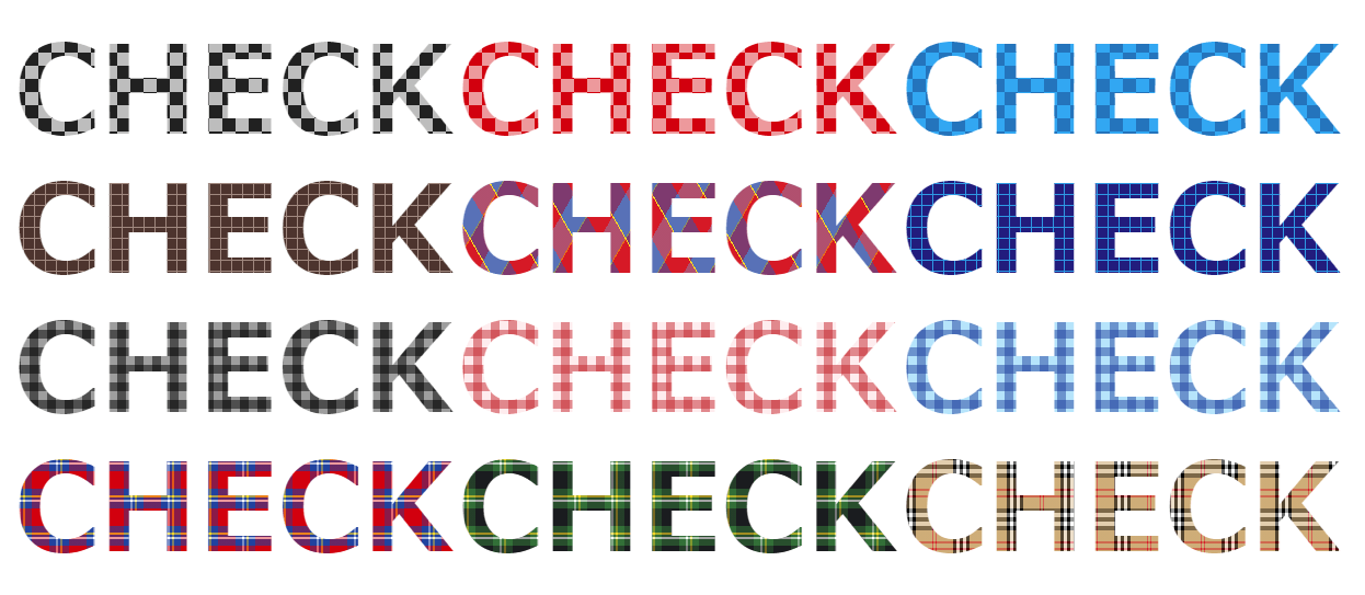
チェッカー
テキストをチェッカー柄に装飾するCSSサンプル集です。
チェッカー柄は、チェッカーフラッグなどで有名なチェック柄でチェッカーフラッグは正しくは黒と白のチェッカー旗となっています。
共通HTML
<p class="sample">ONE NOTE</p>チェッカー柄 モノトーン
テキストをモノトーン調のチェッカー柄にするCSSサンプルです。
See the Pen CSS Design check pattern Monotone by yochans (@yochans) on CodePen.
.sample {
	font-size:6em;
	text-align:center;
	line-height:0.95em;
	font-weight:bold;
	color: transparent;
	background: linear-gradient(45deg, #212121 25%, transparent 25%, transparent 75%, #212121 75%),
		linear-gradient(45deg, #212121 25%, transparent 25%, transparent 75%, #212121 75%);
	background-color: #BDBDBD;
	background-size: 24px 24px;
	background-position: 0 0, 12px 12px;
	-webkit-background-clip: text;
}
チェッカー柄 レッド
テキストを赤色系のチェッカー柄にするCSSサンプルです。
See the Pen CSS Design check pattern Orange by yochans (@yochans) on CodePen.
.sample {
	font-size:6em;
	text-align:center;
	line-height:0.95em;
	font-weight:bold;
	color: transparent;
	background: linear-gradient(45deg, #D50000 25%, transparent 25%, transparent 75%, #D50000 75%),
		linear-gradient(45deg, #D50000 25%, transparent 25%, transparent 75%, #D50000 75%);
	background-color: #EF9A9A;
	background-size: 24px 24px;
	background-position: 0 0, 12px 12px;
	-webkit-background-clip: text;
}
チェッカー柄 ブルー
テキストを青色系のチェッカー柄にしたCSSサンプルです。
See the Pen CSS Design check pattern 01 by yochans (@yochans) on CodePen.
.sample {
	font-size:6em;
	text-align:center;
	line-height:0.95em;
	font-weight:bold;
	color: transparent;
	background: linear-gradient(45deg, #0277BD 25%, transparent 25%, transparent 75%, #0277BD 75%),
		linear-gradient(45deg, #0277BD 25%, transparent 25%, transparent 75%, #0277BD 75%);
	background-color: #03A9F4;
	background-size: 24px 24px;
	background-position: 0 0, 12px 12px;
	-webkit-background-clip: text;
}
ウィンドウペーン
テキストをウィンドウペーン風のチェック柄に装飾するCSSサンプル集です。
ウィンドウ・ペンはイギリスの伝統柄の一つで、各色に単色の縦横の細い枠のラインで均等幅で重ねた四角形のチェック柄です。
共通HTML
<p class="sample">ONE NOTE</p>ウィンドウペーン柄 ブラウン
茶系のウィンドウペーン風チェック柄でデキストを装飾するCSSサンプルです。
See the Pen CSS Design check pattern Brown by yochans (@yochans) on CodePen.
.sample {
	font-size:6em;
	text-align:center;
	line-height:0.95em;
	font-weight:bold;
	color: transparent;
	background-color : #4E342E;
	background-image:
		repeating-linear-gradient( 0deg, #A1887F 0px 1px, transparent 1px 10px),
		repeating-linear-gradient( 90deg, #A1887F 0px 1px, transparent 1px 10px);
	-webkit-background-clip: text;
}
ウィンドウペーン柄 ブルー
青色系のウィンドウペーン風チェック柄でデキストを装飾するCSSサンプルです。
See the Pen CSS Design check pattern B by yochans (@yochans) on CodePen.
.sample {
	font-size:6em;
	text-align:center;
	line-height:0.95em;
	font-weight:bold;
	color: transparent;
	background-color : #1A237E;
	background-image:
		repeating-linear-gradient( 0deg, #039BE5 0px 1px, transparent 1px 10px),
		repeating-linear-gradient( 90deg, #039BE5 0px 1px, transparent 1px 10px);
	-webkit-background-clip: text;
}
ウィンドウペーン柄 グリーン
濃い緑色系のウィンドウペーン風チェック柄でデキストを装飾するCSSサンプルです。
See the Pen CSS Design check pattern window pane Dark Green by yochans (@yochans) on CodePen.
.sample {
	font-size:6em;
	text-align:center;
	line-height:0.95em;
	font-weight:bold;
	color: transparent;
	background-color : #00261F;
	background-image:
		repeating-linear-gradient( 0deg, #00695C 0px 1px, transparent 1px 10px),
		repeating-linear-gradient( 90deg, #00695C 0px 1px, transparent 1px 10px);
	-webkit-background-clip: text;
}
ギンガム・チェック
テキストをギンガム・チェック風のチェック柄に装飾するCSSサンプル集です。
ギンガム・チェックは、主に白等の薄い色を地にして、上から縦横とも同じ太さの色を縞模様で重ねたシンプルなチェック柄です。
共通HTML
<p class="sample">ONE NOTE</p>ギンガム・チェック柄 モノトーン
良くあるモノトーン調ギンガム・チェック風チェック柄でデキストを装飾するCSSサンプルです。
See the Pen CSS Design check pattern gingham check by yochans (@yochans) on CodePen.
.sample {
	font-size:6em;
	text-align:center;
	line-height:0.95em;
	font-weight:bold;
	color: transparent;
	background-color : #9E9E9E;
	background-image:
		repeating-linear-gradient( 0deg, rgba(0, 0, 0, .5) 0px 8px, transparent 8px 16px),
		repeating-linear-gradient( 90deg, rgba(0, 0, 0, .5) 0px 8px, transparent 8px 16px);
	-webkit-background-clip: text;
}
ギンガム・チェック柄 レッド
赤系のギンガム・チェック風チェック柄でデキストを装飾するCSSサンプルです。
See the Pen CSS Design check pattern gingham check Red by yochans (@yochans) on CodePen.
.sample {
	font-size:6em;
	text-align:center;
	line-height:0.95em;
	font-weight:bold;
	color: transparent;
	background-color : #FFEBEE;
	background-image:
		repeating-linear-gradient( 0deg, rgba(198, 40, 40, .5) 0px 8px,	transparent 8px 16px),
		repeating-linear-gradient( 90deg, rgba(198, 40, 40, .5) 0px 8px, transparent 8px 16px);
	-webkit-background-clip: text;
}
ギンガム・チェック柄 ブルー
青系のギンガム・チェック風チェック柄でデキストを装飾するCSSサンプルです。
See the Pen CSS Design check pattern gingham check Blue by yochans (@yochans) on CodePen.
.sample {
	font-size:7em;
	text-align:center;
	line-height:0.95em;
	font-weight:bold;
	color: transparent;
	background-color : #B3E5FC;
	background-image:
		repeating-linear-gradient( 0deg, rgba( 13,  71, 161, .5) 0px 8px, transparent 8px 16px),
		repeating-linear-gradient( 90deg, rgba( 13,  71, 161, .5) 0px 8px, transparent 8px 16px);
	-webkit-background-clip: text;
}
タータン・チェック
テキストをタータン・チェック柄に装飾するCSSサンプル集です。
共通HTML
<p class="sample">ONE NOTE</p>タータン・チェック柄 レッド
良くある赤をベースにした青や白・黄色のラインで作られたタータン・チェック柄を、CSSでデキスト装飾するサンプルデザインです。
See the Pen CSS Design check pattern Tartan by yochans (@yochans) on CodePen.
.sample {
	font-size:8em;
	text-align:center;
	line-height:0.95em;
	font-weight:bold;
	color: transparent;
	background-color : #FFF;
	background-image:
		repeating-linear-gradient( 0deg,
			rgba(	 13,  71, 161, .6) 0px 6px, /*青*/
			rgba( 255, 255, 255, .6) 6px 8px, /*白*/
			rgba(	 13,  71, 161, .6) 8px 10px, /*青*/
			rgba(	255, 214,   0, .6) 10px 12px, /*黄*/
			rgba(	 13,  71, 161, .6) 12px 18px, /*青*/
			rgba( 213,   0,   0, .6) 18px 34px /*赤*/
		),
			repeating-linear-gradient( 90deg,
			rgba(	 13,  71, 161, 1) 0px 6px, /*青*/
			rgba( 255, 255, 255, 1) 6px 8px, /*白*/
			rgba(	 13,  71, 161, 1) 8px 10px, /*青*/
			rgba(	255, 214,   0, 1) 10px 12px, /*黄*/
			rgba(	 13,  71, 161, 1) 12px 18px, /*青*/
			rgba( 213,   0,   0, 1) 18px 34px /*赤*/
		);
	-webkit-background-clip: text;
}
タータン・チェック柄 ブルー
青色をベースにした白・緑・赤色のラインで作られたタータン・チェック柄を、CSSでデキスト装飾するサンプルデザインです。
See the Pen CSS Design check pattern Tartan Blue by yochans (@yochans) on CodePen.
<p class="codepen" data-height="300" data-theme-id="30115" data-default-tab="result" data-user="yochans" data-slug-hash="OJLzRRB" style="height: 300px; box-sizing: border-box; display: flex; align-items: center; justify-content: center; border: 2px solid; margin: 1em 0; padding: 1em;" data-pen-title="CSS Design check pattern Tartan Blue">
  <span>See the Pen <a href="https://codepen.io/yochans/pen/OJLzRRB/">
  CSS Design check pattern Tartan Blue</a> by yochans (<a href="https://codepen.io/yochans">@yochans</a>)
  on <a href="https://codepen.io">CodePen</a>.</span>
</p>
<script async src="https://static.codepen.io/assets/embed/ei.js"></script>
タータン・チェック柄 グリーン
緑色をベースにした白・黄色のラインで作られたタータン・チェック柄を、CSSでデキスト装飾するサンプルデザインです。
See the Pen CSS Design check pattern Tartan Green by yochans (@yochans) on CodePen.
.sample {
	font-size:8em;
	text-align:center;
	line-height:0.95em;
	font-weight:bold;
	color: transparent;
	background-color : #FFF;
	background-image:
		repeating-linear-gradient( 0deg,
			rgba(  49, 110,  54, .6) 0px 6px, /*緑*/
			rgba( 255, 255, 255, .6) 6px 8px, /*白*/
			rgba(  49, 110,  54, .6) 8px 10px, /*緑*/
			rgba(	255, 214,   0, .6) 10px 12px, /*黄*/
			rgba(  49, 110,  54, .6) 12px 18px, /*緑*/
			rgba(  27,   29, 32, .6) 18px 34px /*濃い緑*/
		),
			repeating-linear-gradient( 90deg,
			rgba(  49, 110,  54, 1) 0px 6px, /*緑*/
			rgba( 255, 255, 255, 1) 6px 8px, /*白*/
			rgba(  49, 110,  54, 1) 8px 10px, /*緑*/
			rgba(	255, 214,   0, 1) 10px 12px, /*黄*/
			rgba(  49, 110,  54, 1) 12px 18px, /*緑*/
			rgba(  27,   29, 32, 1) 18px 34px /*濃い緑*/
		);
	-webkit-background-clip: text;
}
バーバリー・チェック
テキストをバーバリー・チェック柄に装飾するCSSサンプル集です。
共通HTML
<p class="sample">ONE NOTE</p>バーバリー・チェック柄
良くあるバーバリーの色に寄せて作ったバーバリー・チェック柄を、CSSでデキスト装飾するサンプルデザインです。
See the Pen CSS Design check pattern Burberry by yochans (@yochans) on CodePen.
.sample {
	font-size:6em;
	text-align:center;
	line-height:0.95em;
	font-weight:bold;
	color: transparent;
	background-color : #FFF;
	background-image:
		repeating-linear-gradient( 0deg,
			rgba(   0,   0,   0, 0.4) 0px 4px, /*黒*/
			rgba( 255, 255, 255, 0.4) 4px 8px, /*白*/
			rgba(   0,   0,   0, 0.4) 8px 12px, /*黒*/
			rgba( 255, 255, 255, 0.4) 12px 16px, /*白*/
			rgba(   0,   0,   0, 0.4) 16px 20px, /*黒*/
			rgba( 209, 172, 118, 0.4) 20px 30px, /*香*/
			rgba( 213,   0,   0, 0.4) 30px 32px,/*赤*/
			rgba( 209, 172, 118, 0.4) 32px 36px, /*香*/
			rgba( 213,   0,   0, 0.4) 36px 38px,/*赤*/
			rgba( 209, 172, 118, 0.4) 38px 48px /*香*/
		),
			repeating-linear-gradient( 90deg,
			rgba(   0,   0,   0, 1) 0px 3px, /*黒*/
			rgba( 255, 255, 255, 1) 3px 6px, /*白*/
			rgba(   0,   0,   0, 1) 6px 9px, /*黒*/
			rgba( 255, 255, 255, 1) 9px 12px, /*白*/
			rgba(   0,   0,   0, 1) 12px 15px, /*黒*/
			rgba( 209, 172, 118, 1) 15px 30px, /*香*/
			rgba( 213,   0,   0, 0.8) 30px 31px,/*赤*/
			rgba( 209, 172, 118, 1) 31px 33px, /*香*/
			rgba( 213,   0,   0, 0.8) 33px 34px,/*赤*/
			rgba( 209, 172, 118, 1) 34px 49px /*香*/
		);
	-webkit-background-clip: text;
}
アーガイル・チェック
テキストをアーガイル・チェック柄に装飾するCSSサンプル集です。
共通HTML
<p class="sample">ONE NOTE</p>アーガイル・チェック柄
良くあるアーガイル・チェック柄に寄せて作ったCSSでデキスト装飾するサンプルです。
See the Pen CSS Design check pattern Argyle by yochans (@yochans) on CodePen.
.sample {
	font-size:7em;
	text-align:center;
	line-height:0.95em;
	font-weight:bold;
	color: transparent;
	background-color : #FFF;
	background-image:
		repeating-linear-gradient( 60deg,
			rgba(	255, 214,   0, 1) 0px 1px, /*黄*/
			rgba(	 13,  71, 161, 0.5) 1px 21px, /*青*/
			rgba( 213,   0,   0, 0.5) 21px 41px /*赤*/
		),
			repeating-linear-gradient( -60deg,
			rgba(	255, 214,   0, 1) 0px 1px, /*黄色*/
			rgba(	 13,  71, 161, 0.5) 1px 21px, /*青*/
			rgba( 213,   0,   0, 0.8) 21px 41px /*赤*/
		);
	-webkit-background-clip: text;
}