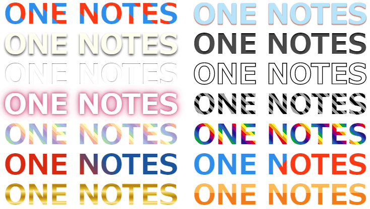
CSSを使ってテキスト文字に影、立体、光沢などを付けて装飾するサンプル集です。
シャドウ系、立体系、ストローク、ネオン、ストライプからグラデーション、メタル風、鏡面反射などカテゴリにわけて紹介していきます。
賛否はあるかもしれませんが、フォントサイズの調整時に崩れないようにする為に各サイズは一部でemを利用して指定しています。
シャドウ
共通HTML
<p class="sample">ONE NOTES</p>シャープな影
text-shadowを使ったシンプルなテキストシャドウCSSコードです。広がりを抑えシャープな影にしています。
See the Pen CSS Text Design : Shadow by yochans (@yochans) on CodePen.
.sample {
	font-size:5em;
	text-align:center;
	line-height:0.95em;
	font-weight:bold;
	color: #FFAB91;
	text-shadow: 0.02em 0.02em 0.02em rgba(0,0,0,1);
}
text-shadowは、上下の位置、左右の位置、影の広がり、影の配色を指定しています。
影の広がりのサイズを小さくする事で濃い影を演出できます。
やわらかい影1
明るい色の影をつけたタイプのやわらかいテキストシャドウCSSです。
See the Pen CSS Text Shadow 04 by yochans (@yochans) on CodePen.
.sample {
	font-size:5em;
	text-align:center;
	line-height:0.95em;
	font-weight:bold;
	color: #01579B;
	text-shadow: 0 0 0.2em rgba(255,255,255,1);
}
text-shadowは、上下の位置、左右の位置、影の広がり、影の配色を指定しています。
影の広がりのサイズを大きくする事で薄い影を演出できます。
やわらかい影2
暗い色の影をつけたタイプのやわらかい影のCSSテキストシャドウです。
See the Pen CSS Text Shadow : 03 by yochans (@yochans) on CodePen.
.sample {
	font-size:5em;
	text-align:center;
	line-height:0.95em;
	font-weight:bold;
	color: #FFF;
	text-shadow: 0 0 0.2em rgba(0,0,0,1);
}
text-shadowは、上下の位置、左右の位置、影の広がり、影の配色を指定しています。
影の広がりのサイズを大きくする事で薄い影を演出できます。
立体・陰影
共通HTML
<p class="sample">ONE NOTES</p>シンプルな立体文字
シンプルな立体に見えるテキストのCSSサンプルです。
See the Pen CSS Text Design Solid 02 by yochans (@yochans) on CodePen.
.sample {
	font-size:5em;
	text-align:center;
	line-height:0.95em;
	font-weight:bold;
	color: #FF6F00;
	text-shadow:
		0 0.01em 0 #999,
		0 0.02em 0 #888,
		0 0.03em 0 #777,
		0 0.04em 0 #666,
		0 0.05em 0 #555,
		0 0.06em 0 #444,
		0 0.08em 0 #000;
}
text-shadowを複数していくことで、影にグラデーションをつけて奥行きを作ります。
やわらかい感じの立体文字
柔らかい配色を使った立体に見えるテキストのCSSサンプルです。
See the Pen CSS Text Design Solid 03 by yochans (@yochans) on CodePen.
.sample {
	font-size:5em;
	text-align:center;
	line-height:0.95em;
	font-weight:bold;
	text-shadow:
		0 0.03em 0.03em #FFAB91,
		0 0.03em 0.03em #000,
		0 0.03em 0.03em #FBE9E7;
}
背景色に馴染む立体文字
同色・類似色のテキストにすることで背景色に馴染むCSSサンプルになります。
See the Pen CSS Text Design Solid 04 by yochans (@yochans) on CodePen.
.sample {
	font-size:5em;
	text-align:center;
	line-height:0.95em;
	font-weight:bold;
	color: #fffff0;
	text-shadow:
		0 0.05em 0.08em rgba(0,0,0,0.7);
}
※親要素の背景色には「background-color: #FDF5E6;」を指定しています。
2段の立体部分
2段階に影の部分をずらした立体に見えるテキストのCSSサンプルコードです。
See the Pen CSS Text Design Solid 05 by yochans (@yochans) on CodePen.
.sample {
	font-size:5em;
	text-align:center;
	line-height:0.95em;
	font-weight:bold;
	color: #03A9F4;
	text-shadow:
		0.04em 0.02em 0 #B0BEC5,
		0.08em 0.05em 0 rgba(0, 0, 0, 0.6);
}
※親要素の背景色には「background-color: #FDF5E6;」を指定しています。
立体文字に影1
影付きの立体部分を高くしたように見えるCSSサンプルコードです。
See the Pen CSS Text Design Solid 06 by yochans (@yochans) on CodePen.
.sample {
	font-size:5em;
	text-align:center;
	line-height:0.95em;
	font-weight:bold;
	color: #FDF5E6;
	text-shadow:
		1px -1px 1px #BDBDBD,
		-1px 2px 1px #737272,
		-2px 4px 1px #767474,
		-3px 6px 1px #787777,
		-4px 8px 1px #424242,
		-5px 10px 1px #616161,
		-6px 12px 1px #757575,
		-7px 14px 1px #9E9E9E,
		-8px 16px 1px #BDBDBD,
		-9px 18px 1px #E0E0E0;
}
※親要素の背景色には「background-color: #FDF5E6;」を指定しています。
立体文字に影2
影付きの立体部分を高くしたように見えるCSSサンプルコードです。
背景色と違う色を乗せたバージョンです。
See the Pen CSS Text Design Solid 06 by yochans (@yochans) on CodePen.
.sample {
	font-size:5em;
	text-align:center;
	line-height:0.95em;
	font-weight:bold;
	color: #A5D6A7;
	text-shadow:
		1px -1px 1px #BDBDBD,
		-1px 2px 1px #737272,
		-2px 4px 1px #767474,
		-3px 6px 1px #787777,
		-4px 8px 1px #424242,
		-5px 10px 1px #616161,
		-6px 12px 1px #757575,
		-7px 14px 1px #9E9E9E,
		-8px 16px 1px #BDBDBD,
		-9px 18px 1px #E0E0E0;
}
※親要素の背景色には「background-color: #FDF5E6;」を指定しています。
3DテキストのCSS作成ツール | REPOP WEBツール集
凹みタイプ1
背景に対して、凹んでいるように見えるテキストデコレーションです。
以下の記事にてより多くのCSSデザインサンプルを紹介しています。
CSS | テキストを凹んだように見せるサンプル集 | ONE NOTES
See the Pen CSS Text Design Solid 01 by yochans (@yochans) on CodePen.
.sample {
	font-size:5em;
	text-align:center;
	line-height:0.95em;
	font-weight:bold;
	color: transparent;
	background : rgba(0,0,0,1);
	text-shadow :
		0 0 0.1em rgba(255,255,255,0.05),
		0.01em 0.04em 0.03em rgba(255,255,255,0.4);
	-webkit-background-clip : text;
}
凹みタイプ2
背景に対して、凹んでいるように見えるテキストデコレーションCSSです。
凹んだ部分の配色が明るい色でも、凹んでいるように見えます。
See the Pen CSS Text Design Solid 08 by yochans (@yochans) on CodePen.
.sample {
	font-size:5em;
	text-align:center;
	line-height:0.95em;
	font-weight:bold;
	color: transparent;
	background : rgba(0,0,0,1);
	text-shadow :
		0 0 0.1em rgba(255,255,255,1),
		0.01em 0.02em 0.02em rgba(255,255,255,1);
	-webkit-background-clip : text;
}
ストローク(縁取り)
共通HTML
<p class="sample">ONE NOTES</p>シンプルなストロークテキスト
text-strokeを使ったシンプルなストロークテキストのCSSカスタマイズになります。
See the Pen CSS Text Design Storck 01 by yochans (@yochans) on CodePen.
.sample {
	font-size:5em;
	text-align:center;
	line-height:0.95em;
	font-weight:bold;
 	color: transparent;
	-webkit-text-stroke: 0.02em rgba(255,255,255,1);
}
透明度があるストロークテキスト
text-strokeを使ったストローク部分に透明度を与えたCSSサンプルコードです。
See the Pen CSS Text Design Storck 02 by yochans (@yochans) on CodePen.
.sample {
	font-size:5em;
	text-align:center;
	line-height:0.95em;
	font-weight:bold;
	color: transparent;
	-webkit-text-stroke: 0.04em rgba(255,255,255,0.5);
}
シャープなストロークテキスト
背景色に馴染むtext-strokeを使ったストロークテキストです。
See the Pen CSS Text Design Storck 02 by yochans (@yochans) on CodePen.
.sample {
	font-size:7em;
	text-align:center;
	line-height:0.95em;
	letter-spacing: 0.05em;
	color: transparent;
	-webkit-text-stroke: 0.03em rgba(0,0,0,1);
}
text-shadowで作るストロークテキスト
text-shadowを使ったCSSカスタマイズサンプル。
See the Pen CSS Text Design Storck 04 by yochans (@yochans) on CodePen.
.sample {
	font-size:5em;
	text-align:center;
	line-height:0.95em;
	font-weight:bold;
	color: #000;
	text-shadow:
		-1px 0 white,
		0 1px white,
		1px 0 white,
		0 -1px white;
}
親要素の背景色とテキスト色を同色または類似色にすることで、ストローク風のテキストにしています。
ネオン
共通HTML
<p class="sample">ONE NOTES</p>淡い赤色のネオン文字
淡い赤色に光っているように見えるCSSシャドウサンプルです。
See the Pen CSS Text Design Solid 04 by yochans (@yochans) on CodePen.
.sample {
	font-size:5em;
	text-align:center;
	line-height:0.95em;
	font-weight:bold;
	color: #FFF;
	text-shadow:
		0 0 0.05em #F06292,
		0 0 0.10em #F06292,
		0 0 0.15em #F06292,
		0 0 0.30em #F06292;
	filter: saturate(80%);
}
青色に光るネオン文字
青白く光っている様に見えるタイプのCSSテキストです。
See the Pen CSS Text Design Neon 02 by yochans (@yochans) on CodePen.
.sample {
	font-size:5em;
	text-align:center;
	line-height:0.95em;
	font-weight:bold;
	color: #FFF;
	text-shadow:
		0 0 0.10em #2962FF,
		0 0 0.15em #2962FF,
		0 0 0.80em #2962FF,
		0 0 1.00em #2962FF;
}
暗い文字をネオン発光
暗い文字をネオン発光されたタイプのCSSデザインです。
See the Pen CSS Text Design Neon 03 by yochans (@yochans) on CodePen.
.sample {
	font-size:5em;
	text-align:center;
	line-height:0.95em;
	font-weight:bold;
	color: #000;
	text-shadow:
		0 0 0.05em #FFF59D,
		0 0 0.06em #FFF59D,
		0 0 0.07em #FFF59D,
		0 0 0.08em #FFF59D,
		0 0 0.09em #FFF59D,
		0 0 0.20em #FFF59D,
		0 0 0.20em #FFF59D,
		0 0 0.20em #FFF59D,
		0 0 0.50em #FFF59D;
}
ストライプ(縞々)
共通HTML
<p class="sample">ONE NOTES</p>横ストライプ
2色からなる横ストライプのCSSサンプルコードです。
See the Pen CSS Text Design Stripe 0deg by yochans (@yochans) on CodePen.
.sample {
	font-size:5em;
	text-align:center;
	line-height:0.95em;
	font-weight:bold;
	color: transparent;
	background: repeating-linear-gradient( 0deg, #A1887F 0 0.1em, #6D4C41 0.1em 0.2em );
	-webkit-background-clip: text;
}
repeating-linear-gradientで指定する角度(deg)を変更する事で、ストライプの向きを調整可能です。
縦ストライプ
2色からなる縦ストライプのCSSサンプルコードです。
See the Pen CSS Text Design Stripe 90deg by yochans (@yochans) on CodePen.
repeating-linear-gradientで指定する角度(deg)を変更する事で、ストライプの向きを調整可能です。
.sample {
	font-size:5em;
	text-align:center;
	line-height:0.95em;
	font-weight:bold;
	color: transparent;
	background: repeating-linear-gradient( 90deg, #2196F3 0 0.1em, #90CAF9 0.1em 0.2em );
	-webkit-background-clip: text;
}
repeating-linear-gradientで指定する角度(deg)を変更する事で、ストライプの向きを調整可能です。
斜めストライプ
2色からなる斜めストライプのCSSサンプルコードです。
See the Pen CSS Text Design Stripe 45deg by yochans (@yochans) on CodePen.
.sample {
	font-size:5em;
	text-align:center;
	line-height:0.95em;
	font-weight:bold;
	color: transparent;
	background: repeating-linear-gradient( 45deg, #9E9E9E 0 0.1em, #000 0.1em 0.2em );
	-webkit-background-clip: text;
}
repeating-linear-gradientで指定する角度(deg)を変更する事で、ストライプの向きを調整可能です。
右上からの斜めストライプは-45degまたは135degになります。
2色ストライプ
カラーを調整しやすい2色のストライプCSSサンプルです。
ストライプ幅を広げています。
See the Pen CSS Text Design Stripe 2 color by yochans (@yochans) on CodePen.
.sample {
	font-size:5em;
	text-align:center;
	line-height:0.95em;
	font-weight:bold;
	color: transparent;
	background: repeating-linear-gradient( 45deg, #FF3D00 0 0.4em, #0091EA 0.4em 0.8em);
	-webkit-background-clip: text;
}
レインボー(虹色)のストライプ(やわらか色)
柔らかい色の虹色ストライプCSSサンプルコードです。
See the Pen CSS Text Design Stripe RAINBOW 1 by yochans (@yochans) on CodePen.
.sample {
	font-size:5em;
	text-align:center;
	line-height:0.95em;
	font-weight:bold;
	color: transparent;
	background: repeating-linear-gradient(45deg,
		#F5B090 0.1em 0.2em,
		#FCD7A1 0.2em 0.3em,
		#FFF9B1 0.3em 0.4em,
		#A5D4AD 0.4em 0.5em,
		#A3BCE2 0.5em 0.6em,
		#A59ACA 0.7em 0.8em,
		#CFA7CD 0.8em 0.9em);
	-webkit-background-clip: text;
}
レインボー(虹色)のストライプ(濃い色)
濃い色の虹色ストライプCSSサンプルコードです。
See the Pen CSS Text Design Stripe RAINBOW2 by yochans (@yochans) on CodePen.
.sample {
	font-size:5em;
	text-align:center;
	line-height:0.95em;
	font-weight:bold;
	color: transparent;
	background: repeating-linear-gradient(45deg,
		#E60012 0.1em 0.2em,
		#F39800 0.2em 0.3em,
		#FFF100 0.3em 0.4em,
		#009944 0.4em 0.5em,
		#0068B7 0.5em 0.6em,
		#1D2088 0.7em 0.8em,
		#CFA7CD 0.8em 0.9em);
	-webkit-background-clip: text;
}
七色の虹ストライプテキストCSSジェネレーター | REPOP WEBツール集
グラデーション
共通HTML
<p class="sample">ONE NOTES</p>2色グラデーションテキスト
See the Pen CSS Text Design Gradation 2 colors by yochans (@yochans) on CodePen.
.sample {
	font-size:5em;
	text-align:center;
	line-height:0.95em;
	font-weight:bold;
	color: transparent;
	background: linear-gradient( 45deg, #DD2C00 0% 40%, #01579B 60% 100% );
	-webkit-background-clip: text;
}
3色グラデーションテキスト
See the Pen CSS Text Design Gradation 3 colors by yochans (@yochans) on CodePen.
.sample {
	font-size:5em;
	text-align:center;
	line-height:0.95em;
	font-weight:bold;
	color: transparent;
	background: linear-gradient( 90deg, #0091EA 0% 30%, #00B0FF 40% 60%, #80D8FF 70% 100% );
	-webkit-background-clip: text;
}
レインボーグラデーション
See the Pen CSS Text Design Gradation RAINBOW by yochans (@yochans) on CodePen.
.sample {
	font-size:5em;
	text-align:center;
	line-height:0.95em;
	font-weight:bold;
	color: transparent;
	background: linear-gradient( 45deg,
		#E60012 20%,
		#F39800 30%,
		#FFF100 40%,
		#009944 50%,
		#0068B7 60%,
		#1D2088 70%,
		#920783 80%);
	-webkit-background-clip: text;
}
七色の虹色グラデーションテキストCSSジェネレーター | REPOP WEBツール集
ツートンカラーのグラデーション1
テキストをツートンカラーにしたCSSデザインコードです。
See the Pen CSS Text Design Gradation Two-tone color 1 by yochans (@yochans) on CodePen.
.sample {
	font-size:5em;
	text-align:center;
	line-height:0.95em;
	font-weight:bold;
	color: transparent;
	background: linear-gradient( 0deg, #F57C00 0% 60% , #FFB74D 60% 100%);
	-webkit-background-clip: text;
}
ツートンカラーのグラデーション2
テキストをツートンカラーにしたCSSデザインコードです。
See the Pen CSS Text Design Two-tone color by yochans (@yochans) on CodePen.
.sample {
	font-size:5em;
	text-align:center;
	line-height:0.95em;
	font-weight:bold;
	color: transparent;
	background: repeating-linear-gradient( -45deg, #FF3D00 0% 50%, #0091EA 50%
		 100% );
	-webkit-background-clip: text;
}
repeating-linear-gradientで指定する角度(deg)を変更する事で、ストライプの向きを調整可能です。
CSSツートンカラーテキスト生成 | REPOP WEBツール集
メタル・光沢
共通HTML
<p class="sample">ONE NOTES</p>ゴールドメタル(黄金色)
金色のメタル風なCSSグラデーションを指定したサンプルコードです。
See the Pen CSS Text Design Metal Gold by yochans (@yochans) on CodePen.
.sample {
	font-size:5em;
	text-align:center;
	line-height:0.95em;
	font-weight:bold;
	color: transparent;
	background: repeating-linear-gradient(0deg, #B67B03 0.1em, #DAAF08 0.2em, #FEE9A0 0.3em, #DAAF08 0.4em, #B67B03 0.5em);
	-webkit-background-clip: text;
}
CSSツートンカラーテキスト生成 | REPOP WEBツール集
ブルーメタル(青色)
青系のメタルCSSグラデーションを指定したサンプルコードです。
See the Pen CSS Text Design Metal Blue by yochans (@yochans) on CodePen.
.sample {
	font-size:5em;
	text-align:center;
	line-height:0.95em;
	font-weight:bold;
	color: transparent;
	background: repeating-linear-gradient(0deg, #0277BD 0.1em, #4FC3F7 0.2em, #E1F5FE 0.3em, #4FC3F7 0.4em, #0277BD 0.5em);
	-webkit-background-clip: text;
}
レッドメタル(赤色)
赤系のメタルCSSグラデーションを指定したサンプルコードです。
See the Pen CSS Text Design Metal Red by yochans (@yochans) on CodePen.
.sample {
	font-size:5em;
	text-align:center;
	line-height:0.95em;
	font-weight:bold;
	color: transparent;
	background: repeating-linear-gradient(0deg, #C62828 0.1em, #EF5350 0.2em, #FFEBEE 0.3em, #EF5350 0.4em, #C62828 0.5em);
	-webkit-background-clip: text;
}
テキストをメタル調に装飾するパターン集はこちらにまとめてあります。
CSSでテキストを光沢やメタル調に装飾するサンプル集 | 1 NOTES
メタル調テキストCSS作成ツール | REPOP WEBツール集
反射・鏡面
共通HTML
<p class="sample">ONE NOTES</p>反射・鏡面 ネオン
ネオン調のテキストを反射させたCSSデザインです。
See the Pen CSS Text Design Mirror Neon by yochans (@yochans) on CodePen.
.sample {
	font-size:5em;
	text-align:center;
	line-height:0.95em;
	font-weight:bold;
	color: #FFF;
	text-shadow:
		0 0 0.05em #F06292,
		0 0 0.10em #F06292,
		0 0 0.15em #F06292,
		0 0 0.30em #F06292;
	filter: saturate(80%);
	-webkit-background-clip: text;
	-webkit-box-reflect: below -0.25em -webkit-gradient(linear, left bottom, left top, from(rgba(255, 255, 255, .6)), to(transparent));
}
反射・鏡面 レインボー
七色ストライプのテキストを鏡面反射させたCSSコードサンプルになります。
See the Pen CSS Text Design Mirror RAINBOW by yochans (@yochans) on CodePen.
.sample {
	font-size:5em;
	text-align:center;
	line-height:0.95em;
	font-weight:bold;
	color: transparent;
	background: repeating-linear-gradient(90deg,
		#E60012 0.1em 0.2em,
		#F39800 0.2em 0.3em,
		#FFF100 0.3em 0.4em,
		#009944 0.4em 0.5em,
		#0068B7 0.5em 0.6em,
		#1D2088 0.7em 0.8em,
		#CFA7CD 0.8em 0.9em);
	-webkit-background-clip: text;
	-webkit-box-reflect: below -0.25em -webkit-gradient(linear, left bottom, left top, from(rgba(255, 255, 255, .6)), to(transparent));
}
反射・鏡面 メタル
メタル調のテキストを鏡面反射させてみました。
See the Pen CSS Text Design Mirror Gold Metal by yochans (@yochans) on CodePen.
.sample {
	font-size:5em;
	text-align:center;
	line-height:0.95em;
	font-weight:bold;
	color: transparent;
	background: repeating-linear-gradient(0deg, #B67B03 0.1em, #DAAF08 0.2em, #FEE9A0 0.3em, #DAAF08 0.4em, #B67B03 0.5em);
	-webkit-background-clip: text;
	-webkit-box-reflect: below -0.25em -webkit-gradient(linear, left bottom, left top, from(rgba(255, 255, 255, .6)), to(transparent));
}
反射・鏡面 文章
長文のテキスト文字列を鏡面反射させるCSSサンプルコードです。
See the Pen CSS Text Design Mirror text by yochans (@yochans) on CodePen.
.sample {
	font-size:1em;
	text-align:center;
	line-height:0.95em;
	font-weight:bold;
	color:#FFF;
	-webkit-box-reflect: below 0 -webkit-gradient(linear, left bottom, left top, from(rgba(255, 255, 255, .6)), to(transparent));
}
チェック柄
チェッカー柄
テキストをチェッカー柄に装飾するCSSサンプルです。
See the Pen CSS Design check pattern 01 by yochans (@yochans) on CodePen.
.sample {
	font-size:6em;
	text-align:center;
	line-height:0.95em;
	font-weight:bold;
	color: transparent;
	background: linear-gradient(45deg, #0277BD 25%, transparent 25%, transparent 75%, #0277BD 75%),
		linear-gradient(45deg, #0277BD 25%, transparent 25%, transparent 75%, #0277BD 75%);
	background-color: #03A9F4;
	background-size: 24px 24px;
	background-position: 0 0, 12px 12px;
	-webkit-background-clip: text;
}
タータン・チェック柄柄
テキストをタータン・チェック柄に装飾するCSSサンプルです。
See the Pen CSS Design check pattern Tartan by yochans (@yochans) on CodePen.
.sample {
	font-size:8em;
	text-align:center;
	line-height:0.95em;
	font-weight:bold;
	color: transparent;
	background-color : #FFF;
	background-image:
		repeating-linear-gradient( 0deg,
			rgba(	 13,  71, 161, .6) 0px 6px, /*青*/
			rgba( 255, 255, 255, .6) 6px 8px, /*白*/
			rgba(	 13,  71, 161, .6) 8px 10px, /*青*/
			rgba(	255, 214,   0, .6) 10px 12px, /*黄*/
			rgba(	 13,  71, 161, .6) 12px 18px, /*青*/
			rgba( 213,   0,   0, .6) 18px 34px /*赤*/
		),
			repeating-linear-gradient( 90deg,
			rgba(	 13,  71, 161, 1) 0px 6px, /*青*/
			rgba( 255, 255, 255, 1) 6px 8px, /*白*/
			rgba(	 13,  71, 161, 1) 8px 10px, /*青*/
			rgba(	255, 214,   0, 1) 10px 12px, /*黄*/
			rgba(	 13,  71, 161, 1) 12px 18px, /*青*/
			rgba( 213,   0,   0, 1) 18px 34px /*赤*/
		);
	-webkit-background-clip: text;
}
バーバリー・チェック柄
テキストをバーバリー・チェック柄に装飾するCSSサンプルです。
See the Pen CSS Design check pattern Burberry by yochans (@yochans) on CodePen.
.sample {
	font-size:6em;
	text-align:center;
	line-height:0.95em;
	font-weight:bold;
	color: transparent;
	background-color : #FFF;
	background-image:
		repeating-linear-gradient( 0deg,
			rgba(   0,   0,   0, 0.4) 0px 4px, /*黒*/
			rgba( 255, 255, 255, 0.4) 4px 8px, /*白*/
			rgba(   0,   0,   0, 0.4) 8px 12px, /*黒*/
			rgba( 255, 255, 255, 0.4) 12px 16px, /*白*/
			rgba(   0,   0,   0, 0.4) 16px 20px, /*黒*/
			rgba( 209, 172, 118, 0.4) 20px 30px, /*香*/
			rgba( 213,   0,   0, 0.4) 30px 32px,/*赤*/
			rgba( 209, 172, 118, 0.4) 32px 36px, /*香*/
			rgba( 213,   0,   0, 0.4) 36px 38px,/*赤*/
			rgba( 209, 172, 118, 0.4) 38px 48px /*香*/
		),
			repeating-linear-gradient( 90deg,
			rgba(   0,   0,   0, 1) 0px 3px, /*黒*/
			rgba( 255, 255, 255, 1) 3px 6px, /*白*/
			rgba(   0,   0,   0, 1) 6px 9px, /*黒*/
			rgba( 255, 255, 255, 1) 9px 12px, /*白*/
			rgba(   0,   0,   0, 1) 12px 15px, /*黒*/
			rgba( 209, 172, 118, 1) 15px 30px, /*香*/
			rgba( 213,   0,   0, 0.8) 30px 31px,/*赤*/
			rgba( 209, 172, 118, 1) 31px 33px, /*香*/
			rgba( 213,   0,   0, 0.8) 33px 34px,/*赤*/
			rgba( 209, 172, 118, 1) 34px 49px /*香*/
		);
	-webkit-background-clip: text;
}
テキストをチェック柄に装飾するパターン集はこちらにまとめてあります。
テキストをチェック柄に装飾するCSSサンプル集 | 1 NOTES
[…] CSSでテキストに影や光沢、立体的に装飾するサンプル集 | ONE NOTES […]
[…] CSS でテキストを彩る装飾サンプル集 | ONE NOTES […]