WordPress | 自作ヘッダーメニューを作成する方法

WordPressテーマのヘッダーナビゲーションメニューを使わずに、自作のヘッダーナビゲーションメニューを作って設置する方法とサンプルコードを紹介しています。

レスポンジブになっていています。
画面幅が狭くなると2段、メニュー数が多い場合は3段表示以上となります。
自作ヘッダーメニューのサンプルコード
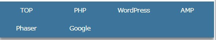
ウィジェットの「ヘッダー下」に「カスタムHTML」を挿入して自作のヘッダーナビゲーションメニューを書いたHTMLを記述しています。
記事作成時の当サイトのままですが、HTMLのサンプルコードは以下の通りです。
<ul class="header-navi">
	<li><a href="https://1-notes.com/">TOP</a></li>
	<li><a href="https://1-notes.com/php/">PHP</a></li>
	<li><a href="https://1-notes.com/word-press/">WordPress</a></li>
	<li><a href="https://1-notes.com/amp/">AMP</a></li>
	<li><a href="https://1-notes.com/phaser/">Phaser</a></li>
	<li><a href="https://1-notes.com/google-tools/">Google</a></li>
</ul>CSSは「style.css」に自作ヘッダーメニューのCSSを追加します。
.header-navi {
	list-style-type: none;
	display: grid;
	grid-template-columns: repeat(auto-fit, minmax(100px, 1fr));
	grid-template-rows: 40px;
	grid-auto-rows: 40px;
	background: #31769e;
	box-shadow: 0px 6px 8px rgba(0, 0, 0, 0.50);
}

.header-navi li {
	display: flex;
	align-items: center;
	justify-content: center;
	box-sizing: border-box;
	transition: .5s;
}

.header-navi li a {
	display: flex;
	align-items: center;
	justify-content: center;
	width: 100%;
	height: 100%;
	color: #FFF;
}

.header-navi li:hover {
	background: #74a1b2;
}
以下は、要素ごとに設定しているCSSの簡単な説明です。
カスタマイズする場合の参考にして下さい。
.header-navi
| list-style-type:none; | リストマークなし |
| display: grid; | グリッドレイアウトするよ |
| grid-template-columns: | 横レイアウトの指定 リンクの文字数が多い場合はmin-widthを増やして対応 |
| grid-template-rows:40px; | 縦レイアウトの指定(1段目の高さ) |
| grid-auto-rows:40px; | 縦レイアウトの指定(2段目以降の高さ) |
| display: flex; align-items: center; justify-content: center; | 親要素内で上下左右中央揃え |
| box-sizing:border-box; | 枠線の重なり対策(上記コードは枠線ない) |
| transition: .5s; | アニメーションする時間(ホバー時の色変え用に) |
.header-navi li
| display: flex; align-items: center; justify-content: center; | 親要素内で上下左右中央揃え |
| box-sizing:border-box; | 枠線の重なり対策(上記コードは枠線ない) |
| transition: .5s; | アニメーションする時間(ホバー時の色変え用に) |
.header-navi li a
| display: flex; align-items: center; justify-content: center; | 親要素内で上下左右中央揃え |
| width:100%; height:100%; | リンク領域を広げる(もっと良い方法が・・!?) |
.header-navi li:hover
| background:#74a1b2; | マウスホバー時の色 |