CSSでサクラの花びら型の要素を作成する方法を紹介しています。
サクラの花びら
CSSのborderと使ったサクラの花びらを作成してみました。
See the Pen CSS | SAKURA by yochans (@yochans) on CodePen.
HTMLはdivタグを追加しています。
<div class="sakura-1"></div>widthとheightはそのままで、border-radiusで葉っぱの太さを調節しています。
transform: rotate()はデフォルト値が指定してありますが、角度を変更する時用です。
.sakura-1 {
width: 150px;
height: 150px;
position: relative;
transform: rotate(0deg);
}
.sakura-1::before {
content: "";
width: 80px;
height: 80px;
position: absolute;
border-radius: 5px 60px 10px 60px;
background-color: #ffb6c1;
transform: rotate(-6deg);
transform-origin: right bottom;
}
.sakura-1::after {
content: "";
width: 80px;
height: 80px;
position: absolute;
border-radius: 5px 60px 10px 60px;
background-color: #ffc0cb;
transform: rotate(6deg);
transform-origin: right bottom;
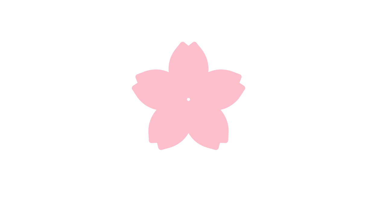
}サクラの花
5枚のサクラの花びらを回転させてみたバージョンです。
See the Pen CSS | SAKURA 02 by yochans (@yochans) on CodePen.
花びらの部分は子要素としていますので、HTMLでdivタグを5つ追加しています。
<div class="sakura-1">
	<div></div><div></div><div></div><div></div><div></div>
</div>
一枚だけのサンプルと違い、サクラの花びら一枚のデザインを子要素のdivに指定している事に注意して下さい。
「transform-origin: right bottom」で回転する基準値、デフォルトの中央から軸を右下に変更します。
葉を5枚360度回転させるので360/5=72、1枚おきに72度間隔で回転させています。
.sakura-1{
	width: 200px; /* 全体の横幅 */
	height: 200px; /* 全体の高さ */
	position: relative;
	transform: rotate(0deg); /* 全体の回転 */
}

.sakura-1 div{
	width: 150px;
	height: 150px;
	position: absolute;
	top: 22px; /* 位置調整 */
	left: 22px; /* 位置調整 */
}

.sakura-1 div::before {
	content: "";
	width: 158px; /* 位置調整もできる */
	height: 158px; /* 位置調整もできる */
	position: absolute;
	border-radius: 5px 60px 10px 60px;
	background-color: #ffc0cb;
	transform: rotate(-6deg);
	transform-origin: right bottom; /* 回転の軸を右下に */
}

.sakura-1 div::after {
	content: "";
	width: 80px;
	height: 80px;
	position: absolute;
	border-radius: 5px 60px 10px 60px;
	background-color: #ffc0cb;
	transform: rotate(6deg);
	transform-origin: right bottom; /* 回転の軸を右下に */
}

.sakura-1 div:nth-of-type(1) {
	transform: rotate(0deg);
}

.sakura-1 div:nth-of-type(2) {
	transform: rotate(72deg);
}

.sakura-1 div:nth-of-type(3) {
	transform: rotate(144deg);
}

.sakura-1 div:nth-of-type(4) {
	transform: rotate(216deg);
}

.sakura-1 div:nth-of-type(5) {
	transform: rotate(288deg);
}